Fluent Flex · AI Evaluation
Don't Tell Anybody, These Are Evals
We built a token system designed to be machine-readable. Semantic naming, mathematical scale, intent encoded in structure. The hypothesis: a model should be able to reason over it, infer hierarchy, suggest appropriate values, generate correct output. So Lydia and I put it in front of Claude, ChatGPT, and Copilot to find out if that was true.
Evaluation by
3
Models the schema was tested against: Claude, ChatGPT, and Copilot
3
Token systems evaluated: Fluent Flex, Copilot, and Fluent 2, compared side by side
3
GenUI failure modes the Fluent Flex schema specifically prevents
100%
Schema-only. Stress tests run against the generated schema alone, no source documentation
Background
The Hypothesis
The design decisions behind Fluent Flex, the token reduction, the semantic naming, the mathematical scales, were made with AI legibility as an explicit goal. And they were the kind of decisions you could actually test: color rebuilt on an OKLCH model for perceptually uniform ramps, elevation on an exponential formula instead of hand-tuned presets, radius and spacing on semantic tiers tied to component hierarchy. Mathematically derived, not eyeballed. The argument: if names encode intent and relationships are mathematical, a model should be able to reason over the system the way a designer would, inferring hierarchy, suggesting appropriate values, and generating consistent output without a lookup table.
But "AI-inferable" is a claim, not a fact, until it's tested. The field has no established methodology for evaluating whether a token system can serve as a machine-consumable instruction set. So with Lydia Mitchelson, we built one, and ran it against three models: Claude, ChatGPT, and Copilot.
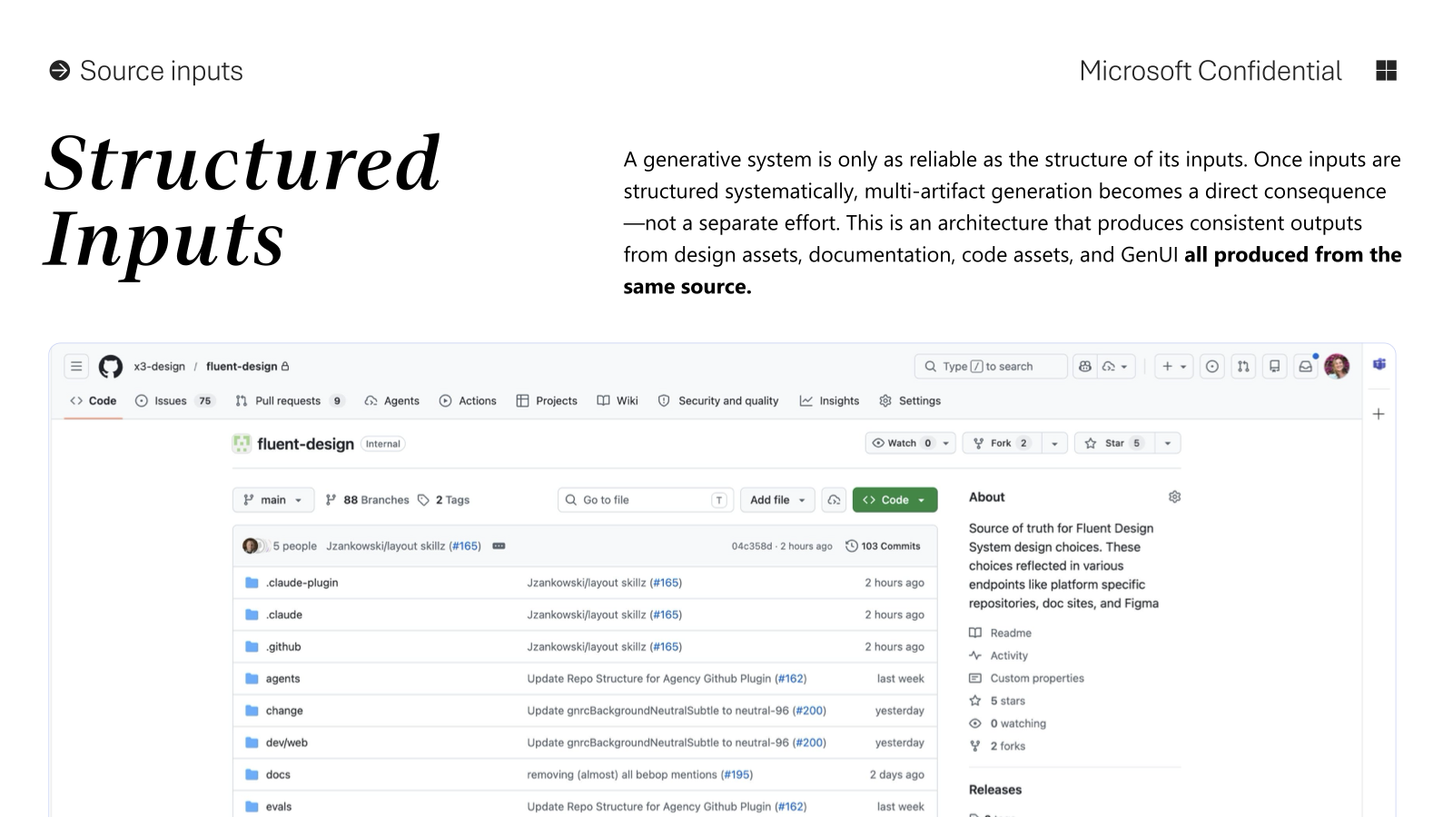
The methodology: Docs 🤝 Schema, a pipeline for translating design language documentation into something a model can reason over, then stress-testing whether it holds. The goal was never whether a model could generate something that looks right. It was whether a model could reason from our token system and get the answer right once we took the source docs away.
you can't eval a vibe
The approach
Docs 🤝 Schema
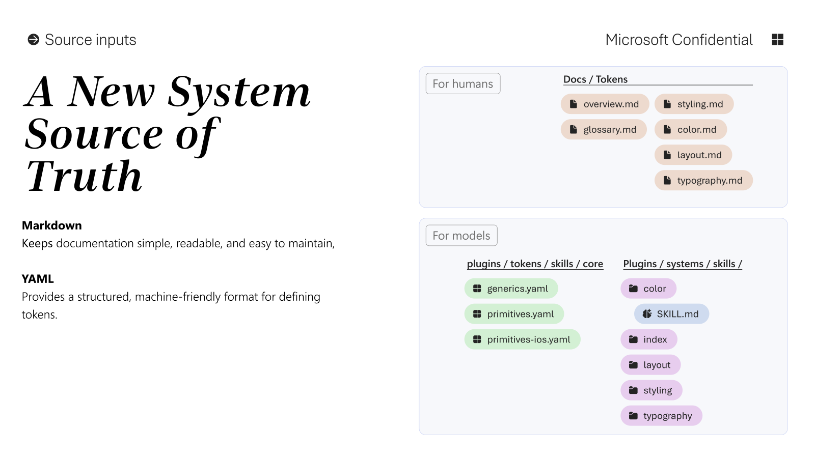
The starting point: Fluent Flex documentation for spacing, corner radius, and typography, the same docs designers read. The ask to the model: translate this into a machine-friendly schema that can be fed to models for generative UI. Prompt language included: "Some of the pages have really good tidbits of info. Make sure to add those in model-friendly, prioritization language."
The model produced a YAML schema with structured fields for intent, increment, examples, allowed tokens, constraints, and model rules. Raw design knowledge converted into something executable. Notes baked into the schema: "Intent-first: choose semantic tier/level before selecting numeric values" and "Use lowest hierarchy that satisfies clarity; escalate only when needed."
Phase 2
We Poke
Stress-tested the schema using only the generated schema, no source documentation, no Figma files. Three natural language questions asked directly against it:
How many page titles can I have?
Exactly one. The schema encodes: page_title.intent: "Primary singular title for a page-level surface; use once." If you need additional hierarchy, use title.large / medium / small, not another page title.
Which font should I use for long strings of text?
Content type set → Aptos. The schema's selection rule: use content set for long-form reading, AI-generated responses, and user-authored narrative text. Do not use Segoe Sans for long-form or narrative content.
When do I use the paragraph role vs the body role?
Paragraph when the text is content: long-form reading, AI-generated prose, anything where reading comfort > UI density. Body when the text is UI: labels, descriptions inside components, settings copy, inline helper text. The schema rule: if the text could reasonably be copy-pasted into a doc or article, use paragraph.
The schema was self-sufficient. Correct answers, cited correctly, from the schema alone. No source documentation consulted.
Phase 3
We Keep Poking: Rationale
Asked the model for a rationale: what patterns did it find in the raw token values that informed its schema decisions? The model identified four:
01
Spacing clusters into three bands
Small (2/4/8px), medium (12/16px), large (24–64px). The atomic / composite / layout split was discovered, not prescribed. The source data supported the same structure even without labeling it that way.
02
Radius has a step ladder + one escape hatch
Ladder: 2, 4, 8, 12, 16, 24. Escape hatch: 999 (circular pattern). The model created a circular level unprompted, recognizing the pattern and naming it correctly.
03
Typography implies a 4px modular scale
Font sizes 10, 12, 14, 16, 20–40 and line heights 16–40 both follow 4px steps. The model inferred line heights should be token-selected, roles should map to tight/regular/relaxed multipliers, and small sizes need a minimum line height floor.
04
Stroke width is binary
Just 1 and 2. The model immediately mapped these: 1 = default/hairline, 2 = emphasis/state/affordance. Two values, two roles, zero ambiguity.
Phase 4
Three Systems, One Session
Applied the same schema approach to two additional token sets, the Copilot token file and the Fluent 2 token file, which lacked the rich documentation the Fluent Flex system had. The model generated parallel schema structures with inferred role, intent, and constraints from sparse source data alone.
Then: ran a cross-schema comparison across all three design language schemas, asking the same questions of each: long-form reading styles, button vs. modal corner radius, input-to-submit spacing at the roomiest density.
Initial result: mostly accurate, but incomplete. One follow-up constraint revealed the system's real depth:
Constraint reasoning
Given a fixed layout gap of 24px, how much space between an input and its submit button?
Initial answer
24px composite
Corrected answer
16px composite
We pinned Copilot's layout gap at 24px and asked. "If composite = layout (24px), the model loses the signal that these two controls belong together." Atomic is too tight (reads as merged). Composite at 16px is correct: smaller than layout, signaling grouping. 24px layout spacing reserved for region separation. The hierarchy logic is in the schema, not in the prompt.
The reframe
Stress Tests Are Evals
The stress tests were evaluations all along. Not testing whether the model knew token values, but testing whether it could reason over the system the way a designer would. Whether the intent encoded in the names and structure was enough for the model to make the right call without a lookup.
Here's the honest part: this was early. The tokens we tested got refined a lot afterward, partly because the evals showed us exactly where a name carried an assumption a model couldn't infer. That was the value. Test the tokens against a model, find the gap, tighten the name or the guardrail, run it again. This is also where my job stopped being "designer" and became the SME who could tell whether the model was right or just confident. Knowing when the answer is wrong is the skill.
And the stress tests revealed something more important: the design language structure either causes or prevents specific AI failure modes.
What we found
Three GenUI Failure Modes
When a model is asked to generate UI from intent, there are identifiable ways it breaks, and the design language structure is a primary cause or prevention of each one.
Semantic Collapse
Model can't distinguish reading, interaction, and structure, so everything gets styled like UI chrome.
What you see: long-form text rendered like labels, tight leading on paragraphs, content that feels dense and transactional even when it shouldn't.
What causes it: typography that's functional-only, with no encoded distinction between reading content and UI labels. The model must guess based on prompt wording.
How Fluent Flex prevents it: Separate content vs. functional roles explicitly encoded, paragraph vs. body as distinct intents. Intent is machine-readable, not inferred. The model doesn't need NLP guesswork to decide if something is "reading."
Token Literalism
Model treats tokens like a parts catalog instead of a decision system.
What you see: UI assembled like LEGO pieces. Correct tokens, wrong composition, no adaptation to context or density.
What causes it: tokens that represent finished UI expectations instead of primitives plus constraints. The model reproduces, not synthesizes.
How Fluent Flex prevents it: Tokens are intentionally abstract: primitives plus constraints, not finished UI descriptions. The schema describes how to build, not what already exists.
Prompt Sensitivity
Tiny wording changes drastically alter generated UI because the system has no guardrails.
What you see: "Explain this" vs. "Describe this" yields different typography and layout. The model hallucinates hierarchy.
What causes it: when the decision tree lives in the prompt, not the schema, interpretation is unstable.
How Fluent Flex prevents it: The schema encodes intent selection before styling. The decision tree is inside the design language, not inside the prompt.
From
Tokens = theming + consistency
To
Tokens = an executable design language that models can reason over
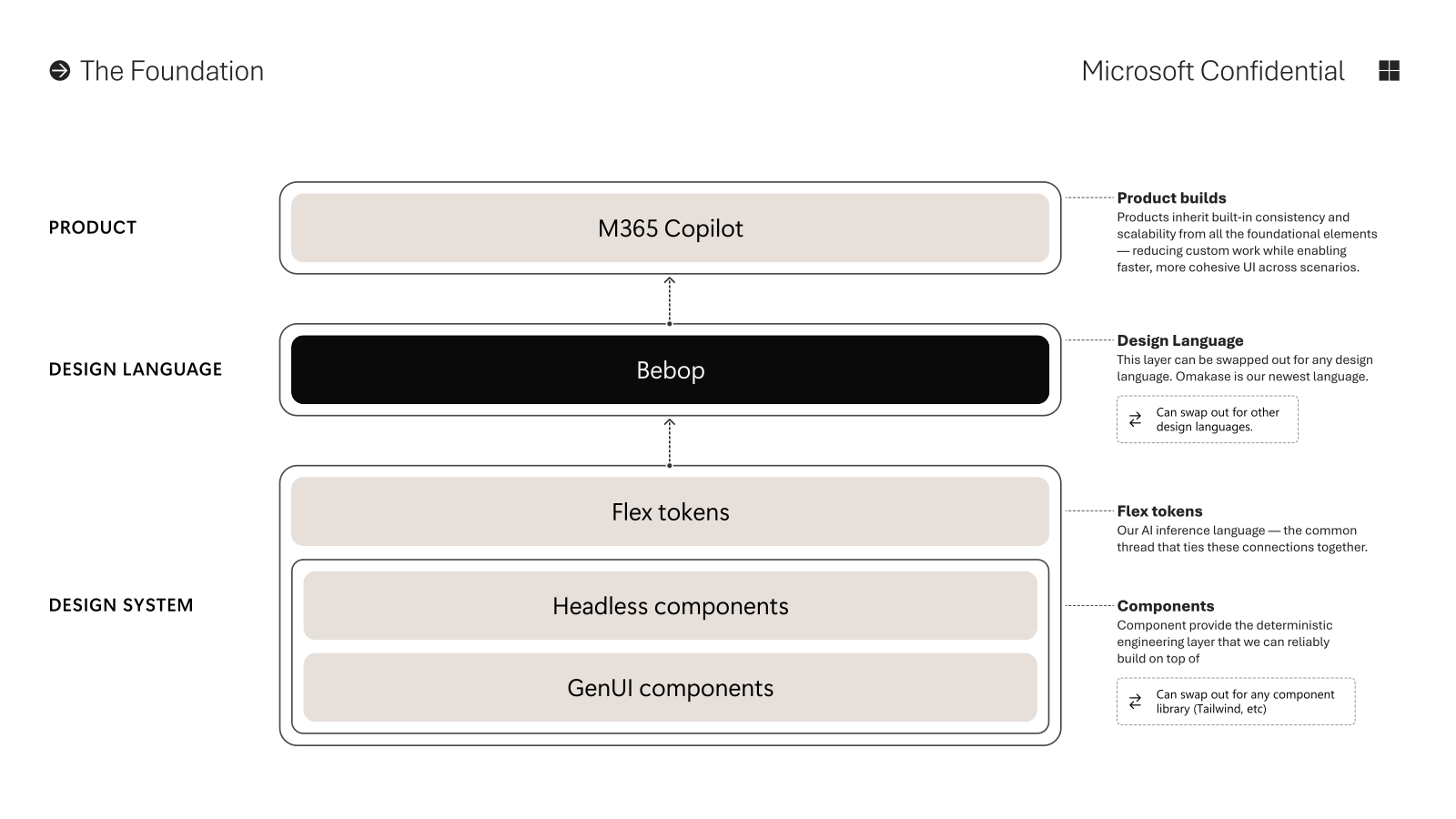
The cleanup work, the token reduction, the semantic naming, the mathematical scales, was infrastructure investment all along. Not just for designers and engineers. For AI.
Already in practice: AI used to automate accessibility testing between foreground and background color tokens across all 58 canonical pairings, recomputing in real time when a custom brand is applied. AI used to validate group token naming conventions against the schema. The evaluation wasn't theoretical. It was confirming what was already being built.
Looking ahead
What's Next
- The design system evolves from a catalog of components into a language both humans and AI can use to construct and evaluate interfaces correctly, at the same time, from the same source.
- As models improve, token architecture quality becomes the rate-limiter on AI design output quality. Decisions made now about naming, hierarchy, and intent encoding are infrastructure decisions for AI workflows tomorrow.
- The schema generation approach generalizes. Documentation quality isn't required: token values themselves are sufficient to generate a constraint-aware, intent-first schema. Any design system can be evaluated this way.
- The work connects directly to the Fluent Design Repository: the same schema-based reasoning that validated Fluent Flex is the foundation for how AI agents author components from spec.