Token System · Microsoft Fluent Design System · M365
The System Under the System
Every downstream artifact — component spec, theme file, AI-generated UI — is an output of the same token architecture. Design intent lives in the token name, so the system scales to new platforms, new brands, and new AI consumers without touching component logic.
Fluent Flex is the token foundation for M365 — the layer between raw design values and the components, themes, and AI systems that consume them. It's not a component library. It's the architecture that makes every other artifact in the system maintainable, themeable, and extendable without rewriting what came before.
The central insight: different types of design values should be named in the style
that matches how that value is reasoned about. Spacing uses algorithmic multipliers
(-base-200) because the math relationship matters. Color uses role-based names
(foreground-neutral-primary) because the intent matters more than the hex.
Elevation uses ordinal words (lowest → highest) because position on a scale
matters, not the math between steps. Each naming convention is a different answer to the
same question: what does a reader — human or model — need to infer the right thing without
a lookup table?
That legibility is what allowed a Microsoft AI team to adopt Flex over Tailwind. It's what allows themes to swap at runtime without touching components. And it's what makes the system a foundation for AI-generated UI, not just a design tool.
On the foundational level, we're focused on core principles and consistent rulesets built on predictability. Across every token category, we moved from selecting values to defining relationships — establishing logical and mathematical foundations and guardrails to keep designers and AI-driven outputs consistent and brand-aligned.
Three tiers. One direction of flow.
Primitives prmt-*
Raw values. What something is, not how it's used. Color stops on a ramp, spacing steps, font sizes. Stable across themes.
prmt-color-fog-26 prmt-font-size-16 prmt-spacing-4 Generics --gnrc-*
Semantic intent. What something does in the experience. These swap values per theme — light, dark, brand — while components stay unchanged.
--gnrc-color-foreground-neutral-primary --gnrc-spacing-component-base-200 --gnrc-border-radius-base-300 Group tokens --grp-*
Product override layer. Teams deviate from the system for specific component groups without breaking theme interoperability.
--grp-button-color-background-brand-soft-hover Themes swap generic token values. Primitives stay constant. Components reference generics. A theme switch updates the entire UI — no component-level changes.
Others tried
Semantic tokens had been attempted — at Microsoft and across the industry. Teams built naming conventions, established tiers, wrote documentation. Some progress happened. None of it fully held at scale. Themes broke. Naming became opaque. Maintenance compounded.
We watched. We learned.
Rather than starting from scratch, we studied what came before — what worked, what didn't, and where things broke under real pressure. The failure modes weren't random. They were architectural. Every prior attempt ran into the same wall: the system worked until it needed to scale. Once real teams with real diverging needs came in, the structure couldn't flex to accommodate them.
Simpler. More meaningful.
Fewer tokens — not because the system does less, but because they're smarter and named better. Critically, the naming was designed to be extensible: teams can add values as they scale without breaking the existing architecture or diverging into their own dialect.
The system is more intuitive to read, easier to adopt, and meaningful enough that AI models can reason over token names without a lookup table.
The chapters
Each family solves a different design problem. The decisions inside each one are where it gets interesting.

Why this matters now
The system is legible to models, not just designers.
Flex is the token foundation for the entire M365 design organization — ~500 designers across 24+ brands, all building on the same architecture. The real test was whether it could convince teams outside M365 to choose it over established alternatives.
The MAI consumer design org did exactly that, converting from a Tailwind plan to Flex
after a 5-presentation roadshow. When a token name encodes its intent —
--gnrc-color-foreground-neutral-primary rather than #242424 —
an AI model can reason about the right usage without a lookup table. That legibility
was the argument. It won.
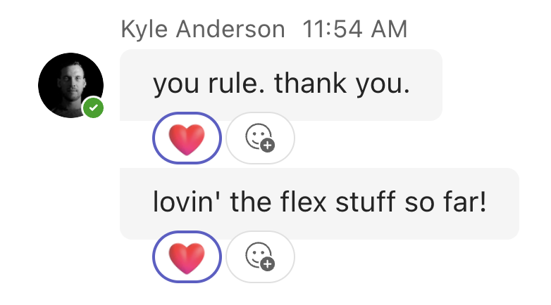
"Tokens have made the work of outputting with AI much more accurate."
"Foundational for all of our AI efforts moving forward."