Fluent Flex · Chapter 02
Color
Fluent's color was a flat list of hand-picked values with no logic tying one shade to the next. It was rebuilt on a perceptually uniform foundation where color is derived, not chosen, and interaction states are generated rather than stored, so a new theme is a handful of decisions instead of hundreds.
~378
Color-related tokens before
66
Semantic color tokens after
0
Interaction states authored by hand
Why it matters
Color Is a System, Not a Palette
People read a product's tone from its color before they read a word of it, so the goal was never a prettier palette. Neutrals carry the structure and stay calm; chroma enters only where it earns attention.
The shift this chapter is about is encoding that judgment into the tokens themselves, rather than leaving it to case-by-case calls, so color means something the same way everywhere.
Background
A Palette People Maintained by Memory
Before Flex, color was a flat list of hand-picked values. Nothing connected one shade to the next, so there was no way to derive what came next or to tell whether two colors were even related. Every new theme meant re-picking colors by hand across the whole range, and every hover and pressed state was stored as its own value, multiplying the list.
It was a palette people maintained by memory, not a system anyone could reason over. Neither could a model.
Before
- No mathematical relationship between shades
- Every theme re-picked by hand across the full range
- Interaction states stored individually
- Impossible for AI to infer how colors related
After
- Every value derived from one perceptual foundation
- Interaction states generated, not stored
- A new theme is a set of seeds, not hundreds of picks
- Legible enough for people and AI to reason over
The rebuild
Derived, Not Chosen
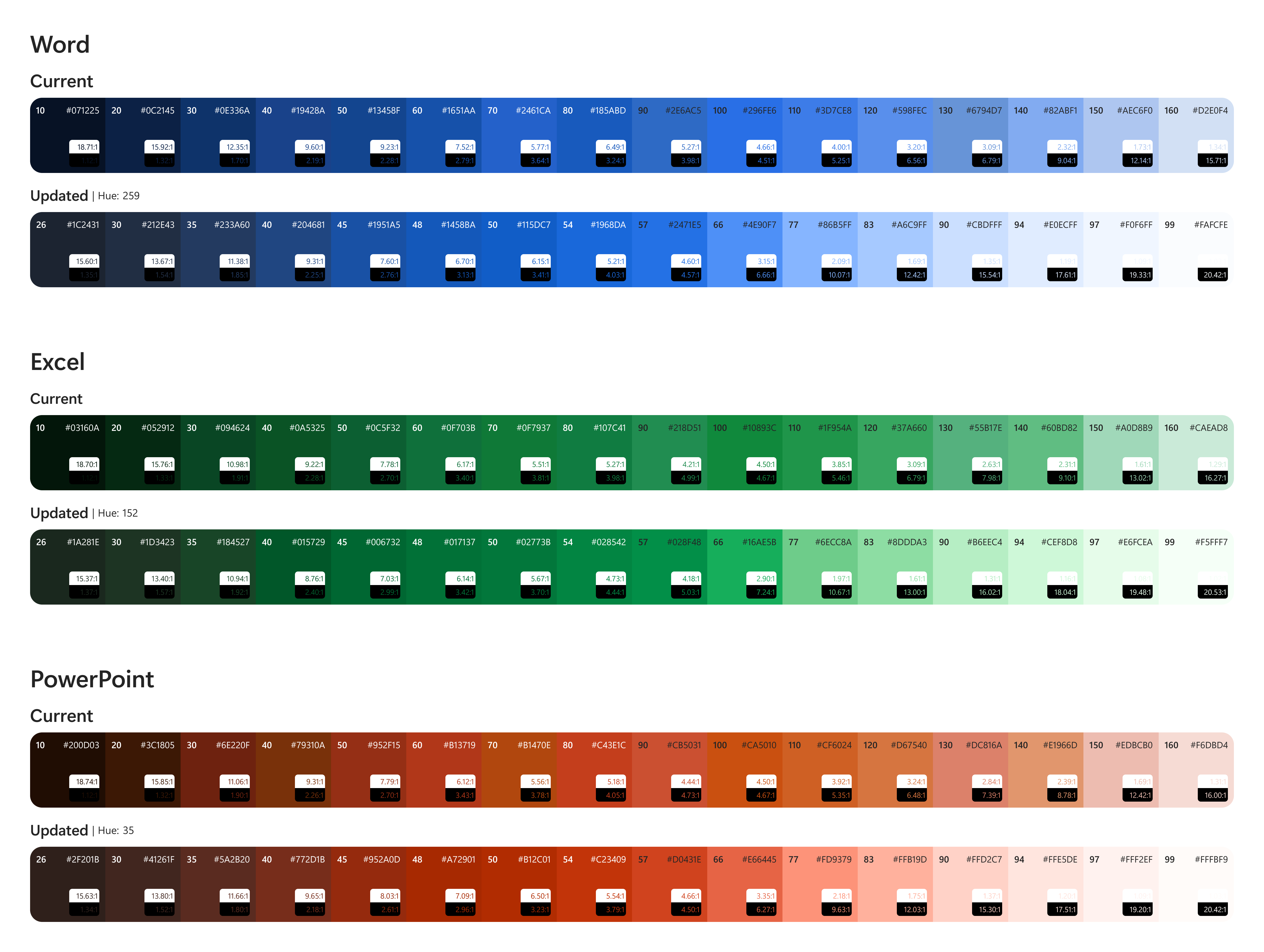
The rebuild started from a perceptually uniform color model, so contrast and hierarchy hold across every hue by math rather than by eye. Every value is derived from that foundation instead of picked one at a time.
Two things fall out of that. Hover and pressed states are generated from a single rule
instead of stored, so changing one value ripples through every component and every theme at
once. And each color is named for its intent, what it is for rather than what it looks like,
so a name like background-brand tells you the job before you ever see the value.
That is what lets a designer, an engineer, or an AI model reach for the right color without a
lookup table.
Color is organized into a small set of semantic families, so the same family always means the same thing everywhere, and swapping a theme never touches a single component.
Impact
What It Unlocked
Because the system is derived, a new brand theme is a handful of seed values run through the model, not hundreds of manual decisions. The same foundation powers the default experience, Copilot theming, and brand theming across many Microsoft brands, and an outside brand can apply its own colors and get a systematically correct, accessible result.
One structure, many theme expressions. The seeds change; the architecture stays constant.
It also made room for something the old list could not express at all: a dedicated palette for expression, editorial color, data visualization, and AI-generated moments, kept separate from status so it never implies success or danger. The counts do not compare one to one, because the new system does more. A smaller core, doing more, not the same job with fewer parts.
The hardest part was accessibility. The rebuild happened during a redesign that leaned hard on neutrals, even for brand, so color could shine only where it earned attention. When most of the interface is monochrome, color cannot be the thing that signals state, so every affordance had to hold up without it.

Collaboration
How This Came Together
Color started with Jack and Mitch. I picked it up when Jack moved into management, created the naming schema, and have scaled and owned it since.
Looking ahead
What's Next
- The derived foundation is the starting point for AI-driven theme generation: seed colors in, an accessible full-range theme out, without a designer tuning every step.
- Intent-based naming is what makes the system legible to AI, so a model can reason about which color fits a context rather than guessing at values.
- Cross-platform color parity continues to improve as the same foundation maps to iOS and Android.