Design Leadership · Microsoft Fluent Design System
Before Anyone Touches a Component
16 active kits with no governing taxonomy. 3,800+ product teams building on a foundation that had never been audited. This is the story of how design leadership gets done at scale: the people management, the org change, and the technical architecture, all at once.
- Role
- Lead: people management, org change, technical architecture
- Team
- 9 designers and 1 UX Engineer across cross-squad effort
- Timeline
- Q4 2024–Q2 2025
- Output
- 9 active kits (down from 16), 102+ refactored components
- Platforms
- Web · iOS · Android (Fluent Core + Copilot kits)
- Impact
- 3,800+ unique consuming teams
By the numbers
Results
16 → 9
Active kits after consolidation: from fragmented to governed
102+
Components refactored for design-to-code parity
3,800+
Unique consuming teams now designing from an audited foundation
10+
Microsoft brands with systematic theming support
~2 wks
To ship Fluent Theme Designer + community kit under a skip-level escalation
4
Distinct kit categories established and published on the Fluent 2 doc site
Impact
Before & After
Before
No standardized definition of what a "kit" even was. Consuming teams reported confusion about which kit to use, which was current, and how to migrate. No tracking, no metrics, no way to know what progress looked like.
- 16 active kits across Web, iOS, Android, Copilot surfaces
- Inconsistent variable naming, outdated components
- No clear ownership model
- No process for what "done" meant for a component
After
A governing taxonomy published on the Fluent 2 doc site. Every kit mapped to a tier with a distinct role. Design-to-code parity across 102+ components. Copilot surfaces with first-class kit support.
- Fluent 2 Design Language, the styling source of truth
- Fluent 2 Core UI Kits, code-aligned building blocks
- Copilot UI Kits, AI-focused components and patterns
- Labs UI Kits, partner-led experimentation
Background
What Fluent's UI Kits Looked Like Before
Fluent's UI kits had grown without a governing framework. Sixteen active kits spanned Web, iOS, Android, and Copilot surfaces, but there was no standardized definition of what a "kit" even was. Kits had different structures, different naming conventions, different update cadences, and no clear ownership model to make any of it consistent.
The problems were documented in the Fluent 2 refinement brief: inconsistent and outdated components, opaque process, and redundancies at every level. Consuming teams (all 3,800+ of them) were building products on top of a foundation that had never been audited. Some teams reported they were hand-rolling Figma files rather than consuming a Fluent kit because they didn't know which kit was current or whether any of them actually reflected the code.
The Problem
Fluent's UI kits were fragmented, outdated, and ungoverned, and 3,800 product teams were consuming that mess as their design foundation. As Fluent grew, unaddressed inconsistencies compounded. Every new component had to work around the existing mess.
Goal 1
A Governing Taxonomy
The first move was definitional: establish what a Fluent kit is and what category it belongs to. Four distinct categories with explicit roles:
The four categories
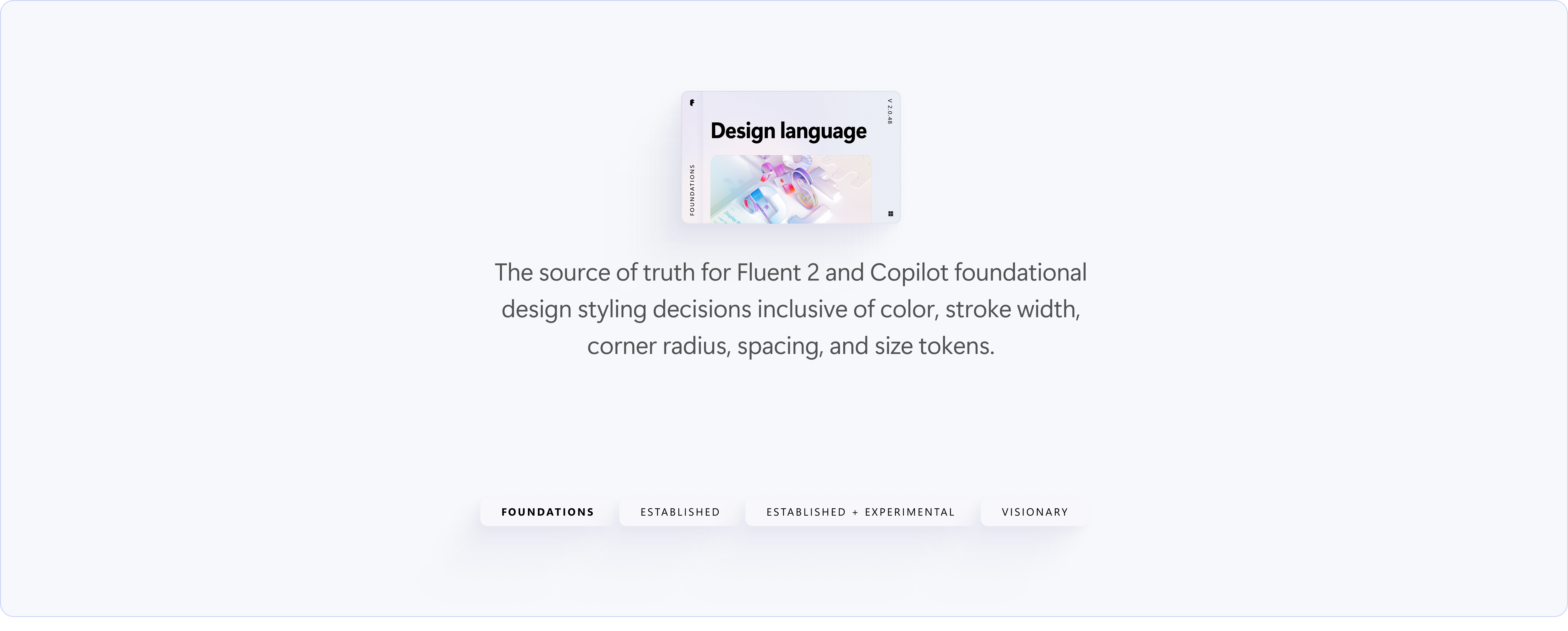
- Fluent 2 Design Language: the source of truth for styling decisions: color, stroke, corner radius, spacing, size tokens. This is where design intent lives.
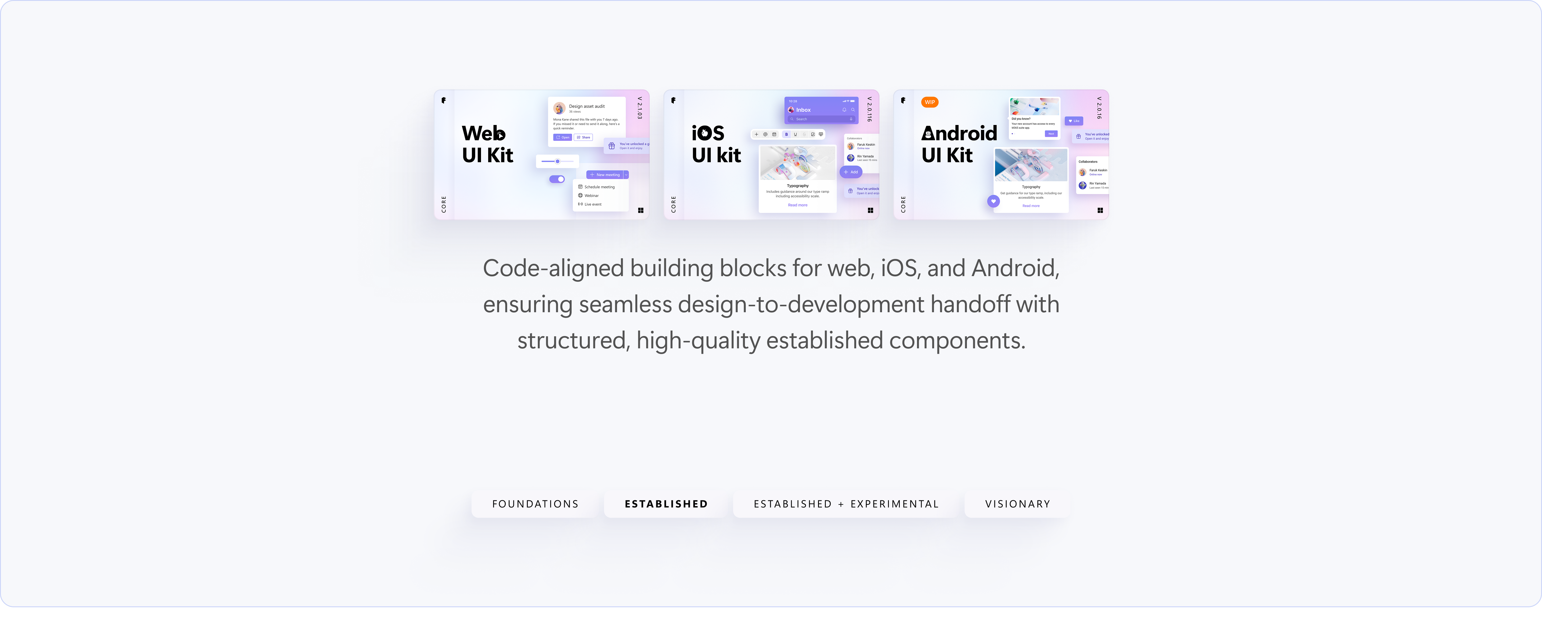
- Fluent 2 Core UI Kits: code-aligned building blocks for Web, iOS, and Android. These must reflect what ships in code.
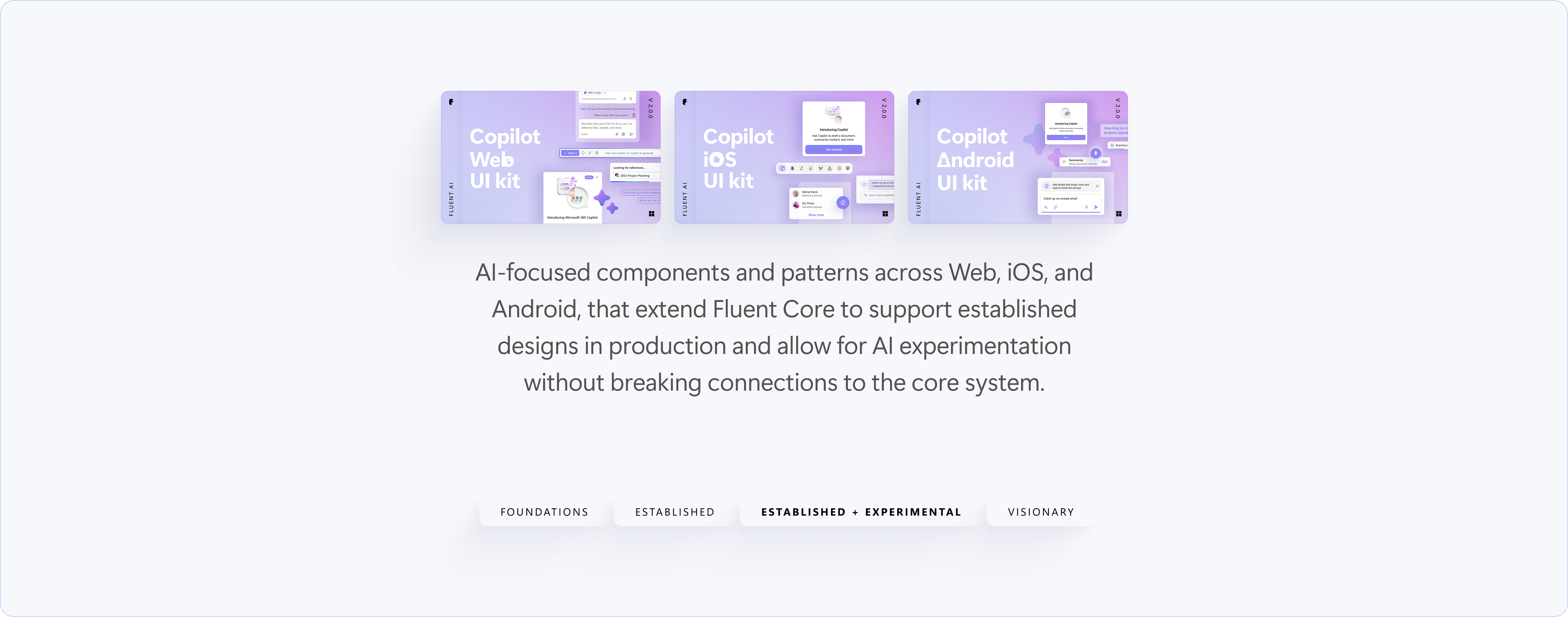
- Copilot UI Kits: AI-focused components and patterns across Web, iOS, Android. Extends Core for AI experiences: a distinct tier, not a fork.
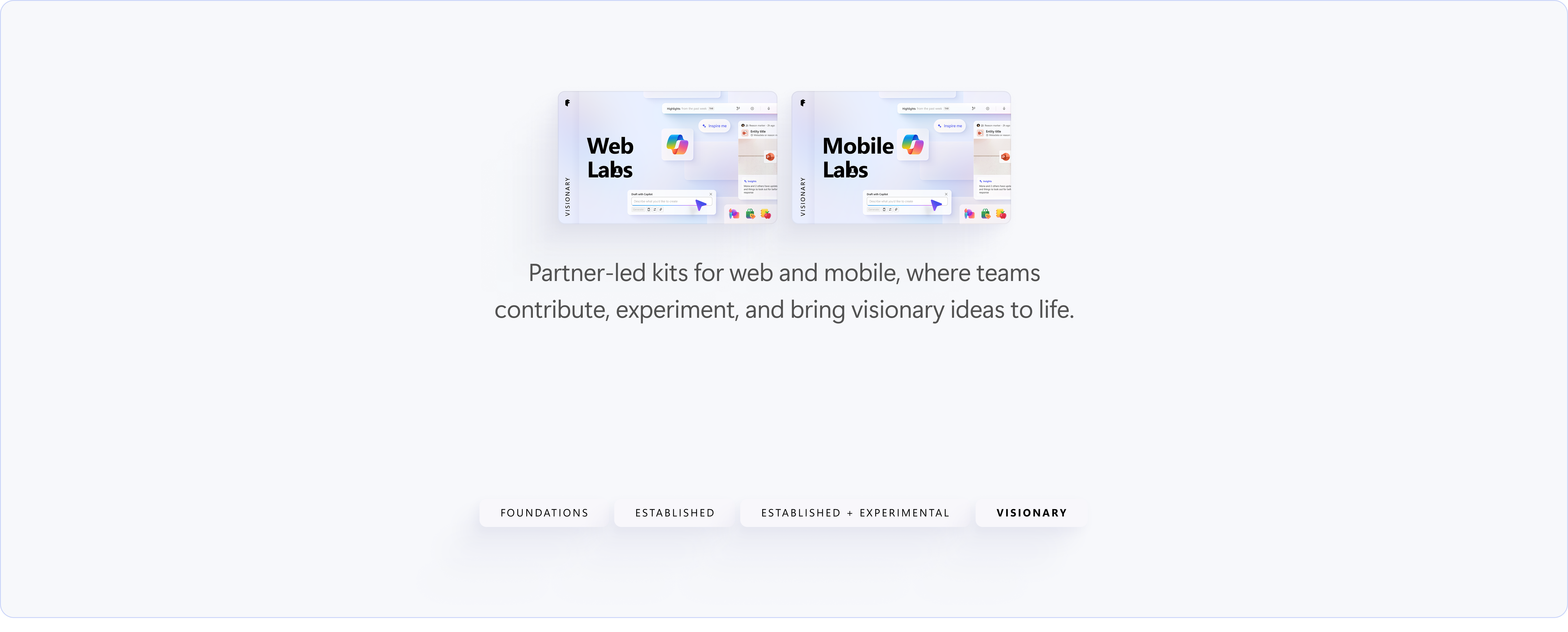
- Labs UI Kits: partner-led experimentation and visionary concepts. The contribution pathway for teams exploring ahead of the roadmap.
Every existing kit was mapped to one of these tiers. Kits with no clear home were candidates for consolidation. The result: 16 active kits compressed to 9.
Goal 2
Design-to-Code Parity
Variable naming and structure were refactored across 102+ components to align Figma variable names exactly to code token names. Before: designers and engineers used different terminology for the same values. After: the same term appears in the Figma variables panel and in the codebase: no translation layer, no lookup table needed.
The refactor also improved Figma file performance directly. Fewer variants, cleaner variable resolution, less redundancy: files that had been slow to open and navigate became usable again as daily design tools.
Goal 3
Systematic Brand Theming
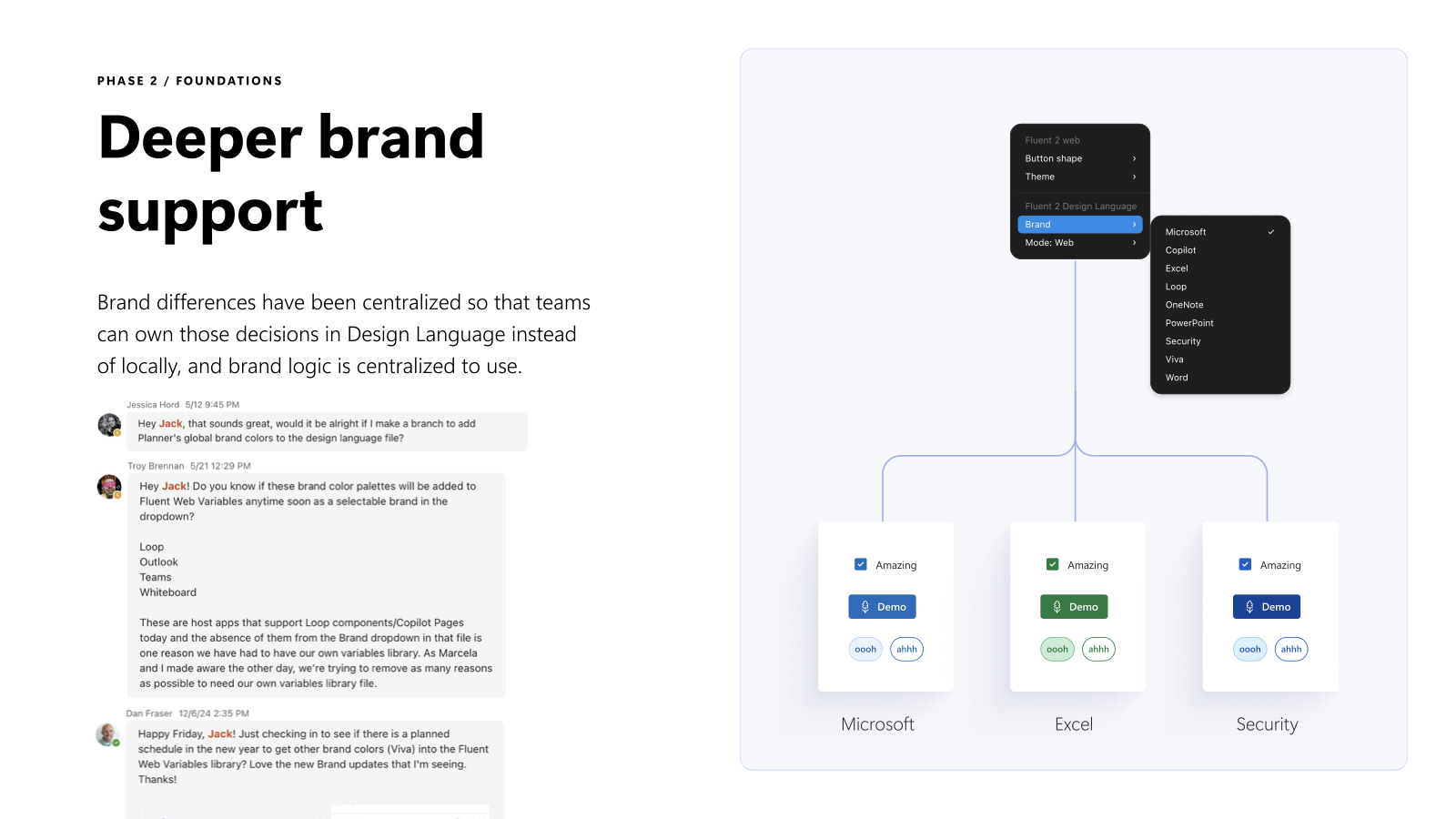
One of the most significant structural changes was how brand theming worked. Before: teams who needed brand customization (for Microsoft sub-brands like Excel, Loop, OneNote, or Word) duplicated the variables platform file and maintained their own fork. This was unsustainable: each fork diverged over time, and there was no path back.
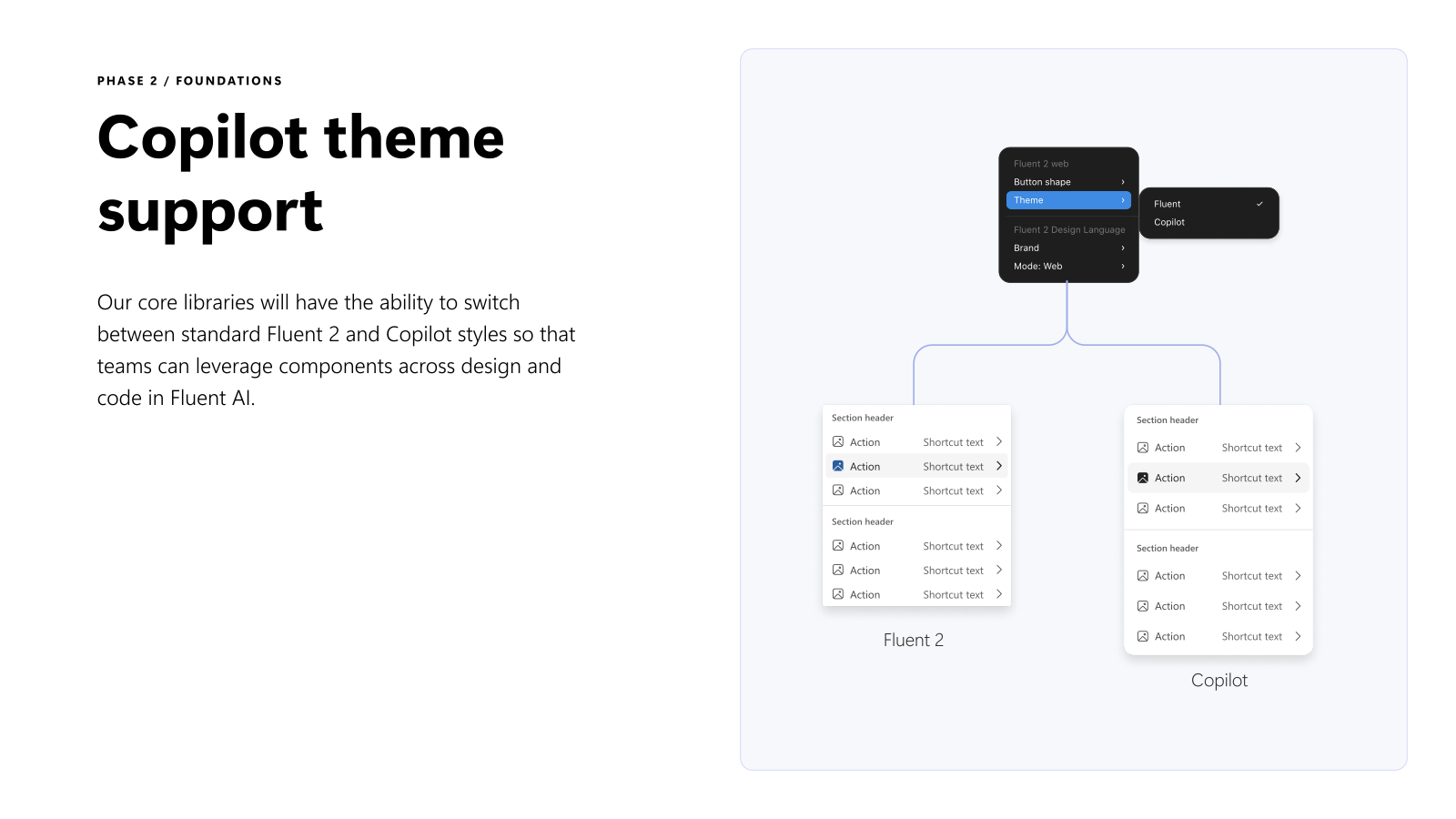
After: a systematic theming approach where brand overrides connect to the core file rather than forking it. Updating the core propagates to every brand, so teams get the latest without maintaining their own copy. And the Copilot UI Kits can now switch between Fluent 2 and Copilot styles at the library level, meaning teams building AI experiences don't need separate files.
This one was built with Jack. He carried the partner outreach and worked through the infrastructure that had to hold underneath it, and Copilot theme support was his lead end to end. Brand theming we shaped together.
The stress test
Two Weeks, Two Deliverables, Under Escalation
The real test of the refactoring work arrived as a last-minute escalation: an external partnership request that landed with no runway and had to ship anyway.
The team delivered in approximately two weeks:
Microsoft Fluent 2 Web Community Kit
An external community kit published to Figma Community, giving any designer outside Microsoft access to Fluent 2 components. Not a simplified version. The actual kit, publicly available.
Fluent Theme Designer, a Figma Plugin
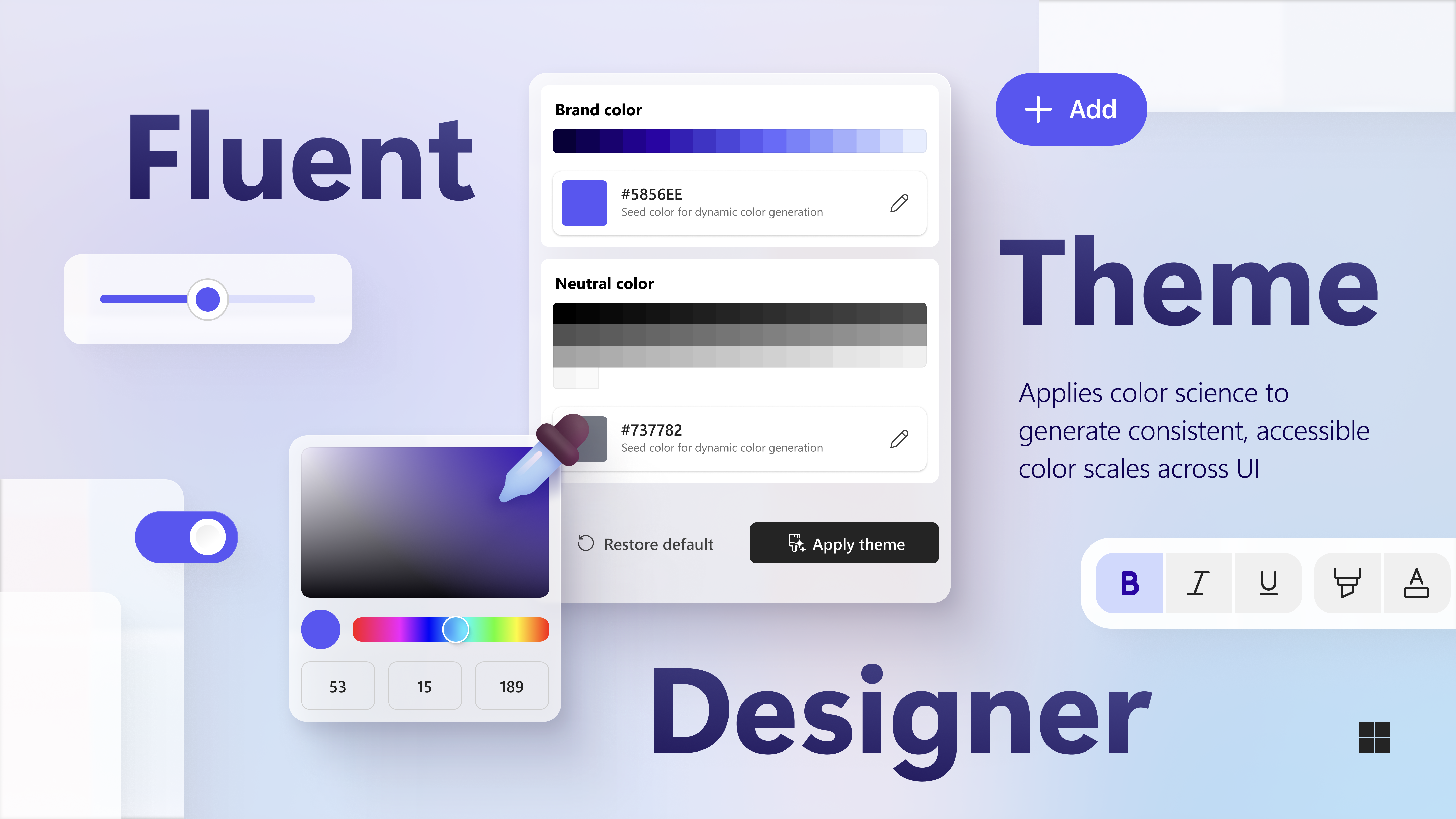
A Figma plugin (also published to Figma Community) that lets any external brand apply their own color identity to Fluent components. It uses color science to generate consistent, accessible color scales: brand theming that's systematic, not manual. A major airline brand applied their brand colors through the plugin to Fluent components; the result shipped as a themed external kit.
The plugin was built by Teryn Kum, a UX Engineer on the team. The tokens architecture gave it something predictable to build against; the plugin itself is Teryn's.
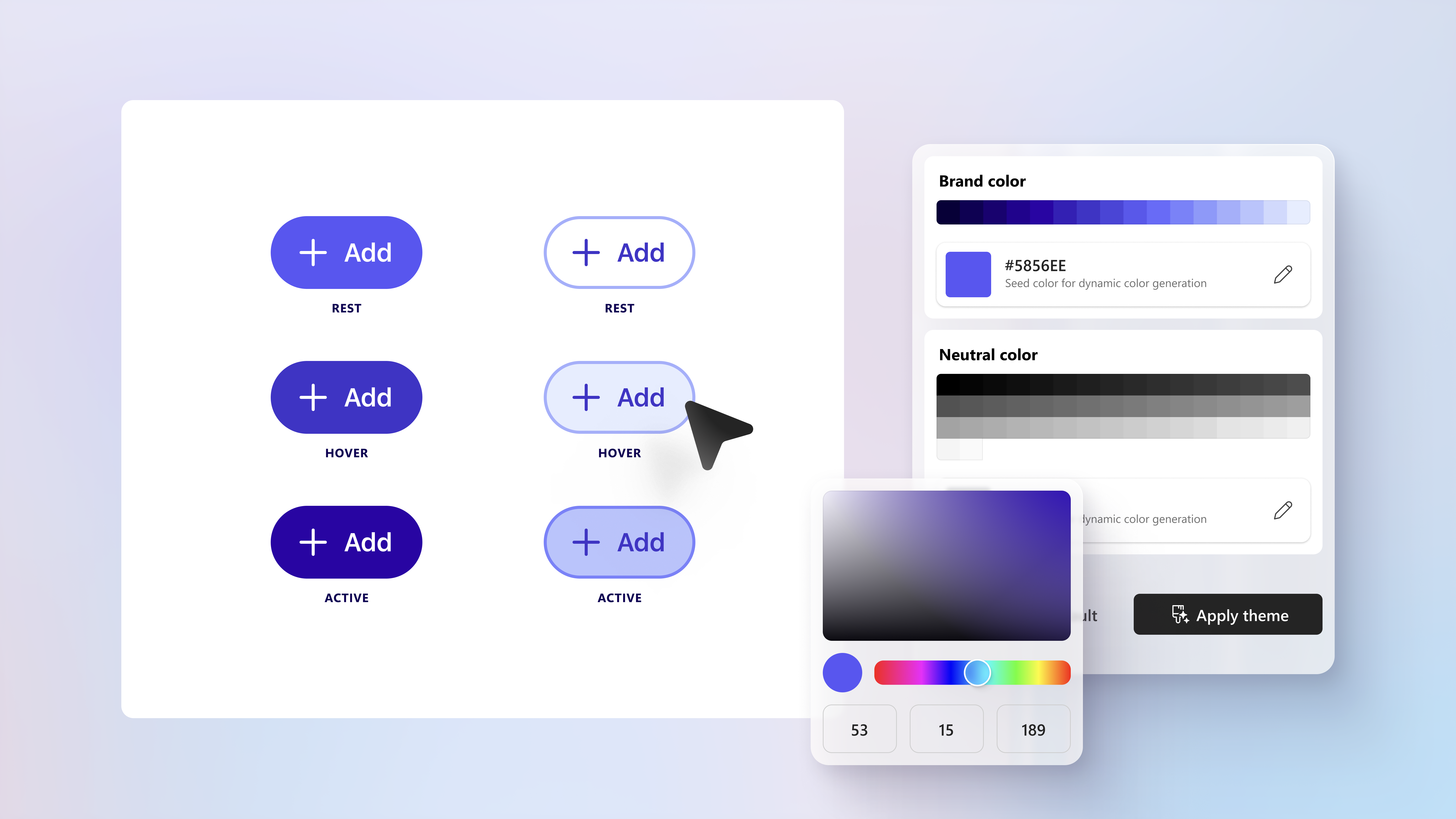
The two-week turnaround was only possible because the architecture was already sound. A refactored variable system, a defined kit taxonomy, and a systematic theming approach meant there was no foundational work left to do, just execution. The mess from before would have made this impossible under that timeline.
Process
Making 9 Designers Move as One
- 01
Introduced the tracker
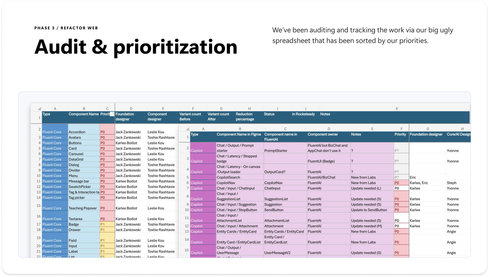
Built an Excel-based tracker to bring visibility to what existed and what progress looked like, component by component and kit by kit, with variant counts, reduction percentages, and status. Before the tracker, there was no way to know what was done, what was in progress, or where overlap was happening. The tracker was a cultural shift, not just a tool.
- 02
Ran structured reviews
Show-and-Tell sessions gave the team a rhythm for sharing progress, surfacing blockers, and keeping the work visible to leadership. Structure without bureaucracy: enough process to keep 9 designers aligned without bottlenecking on one reviewer.
- 03
Created standardized templates
Standardized component templates established a shared scaffold for component structure. With a template, individual component decisions happened within a defined system: consistency came from the structure, not from chasing it across 9 separate workstreams.
- 04
Defined ownership per component and kit section
Every component and kit section had a named owner. Overlap didn't happen because it couldn't. If you owned it, it was yours to ship. Accountability was the mechanism that let 9 designers work in parallel without producing duplicate output.
- 05
Shipped the migration path
Published the new kit structure on the Fluent 2 doc site with guidance for consuming teams: not just a new file to switch to, but documentation of what changed, why, and how to migrate. The work was codified, not just done.
Leadership
What Made This Work
This case study has three concurrent leadership angles running through it: managing people, driving org change, and making technical architecture decisions. Those three things aren't usually in the same job description, but they were inseparable here.
Measurement where none existed
The Excel tracker was the most important thing I built. Before it, there was no way to know what progress looked like. After it, every designer could see their work's relationship to the whole, and leadership could see whether the project was on track without a status meeting. Introducing measurement changed the way the team worked.
Defining what "done" meant
The unblocking move wasn't a design decision. It was establishing clear definitions: what counts as a P0 component, what "refactored" means, what the acceptance criteria are for a kit to be published. Without those definitions, everyone was making individual judgment calls and no one could agree on whether anything was finished. With them, the team could make progress because they all knew when to stop.
Delivering under escalation pressure
When a skip-level override turned a "no" into a two-week deadline, the team shipped both the community kit and the brand-theming plugin on time. This is the most honest evidence that the foundation was sound. A two-week turnaround on two public-facing deliverables is only possible if there's no structural work left to do, and there wasn't, because the refactor was already done.
Looking ahead
What's Next
- The kit framework is the consumer surface for the Flex Tokens system: variables flow from Design Language into Core and Copilot kits. The taxonomy and the token architecture are designed to work together.
- Copilot theme support in Core libraries means teams building AI experiences don't need separate files. One library, two modes. The infrastructure is in place.
- Labs as an accelerator for visionary work: the tier structure creates a clear contribution pathway for partner teams exploring ahead of the roadmap.
- The Fluent Theme Designer plugin scales the brand-theming capability externally: as more teams adopt it, the color-science approach becomes the standard for accessible brand customization.