Theme Architecture · Fluent Design System
From Fork to Framework: Copilot Theming at Scale
The Copilot theme is an extension of Fluent 2 — not a fork. Updated tokens, a unified variable architecture, and a brand theming framework that now supports 24 Microsoft products on one shared foundation, with no breaking changes.
- Role
- Co-Design Lead — token architecture, code-to-design parity, brand theming
- Partners
- 2 Designers · 3 UX Engineers · 3 Engineers
- Scope
- Code and Figma assets across Fluent AI and Fluent UI
- Delivered
- Q2–Q3 2025 · Shipped to Ignite deadline
By the numbers
What shipped
72
Components delivered across code and Figma at full parity
8
Net-new tokens added to support the Copilot theme redesign — 4 radius and 4 spacing values extending the Fluent scale
0
Breaking changes to existing consumers — CopilotTheme shipped as a fully additive layer via CopilotProvider
1
Variable switch in Figma, mirrored by CopilotProvider in code — Fluent 2 and Copilot themes unified across design and engineering
89
Tokens missing from Figma that existed in Storybook — identified and added to close the code-to-design gap
24
Microsoft brands now supported on the shared Fluent token layer — 8 onboarded at launch, grown to 24 since
The shift
Before & After
Before
Copilot launched without a real Fluent token layer. Designers built around the kit — duplicating components, overriding values by hand. No shared system, no code parity.
Brand teams compounded it: each team copied the variables platform file and manually overrode colors in isolation. Every fork was a maintenance liability drifting independently.
After
shared
foundation.
CopilotProvider wraps FluentProvider. One mode switch in Figma updates font family, radius, spacing, and type ramp together. Design and code move as one.
One dropdown for brand. Copilot, Excel, Loop, Word, OneNote, PowerPoint, Security, Viva — all 8 derived from the same Fluent foundation. Change the property, not the file.
Context
The Problem
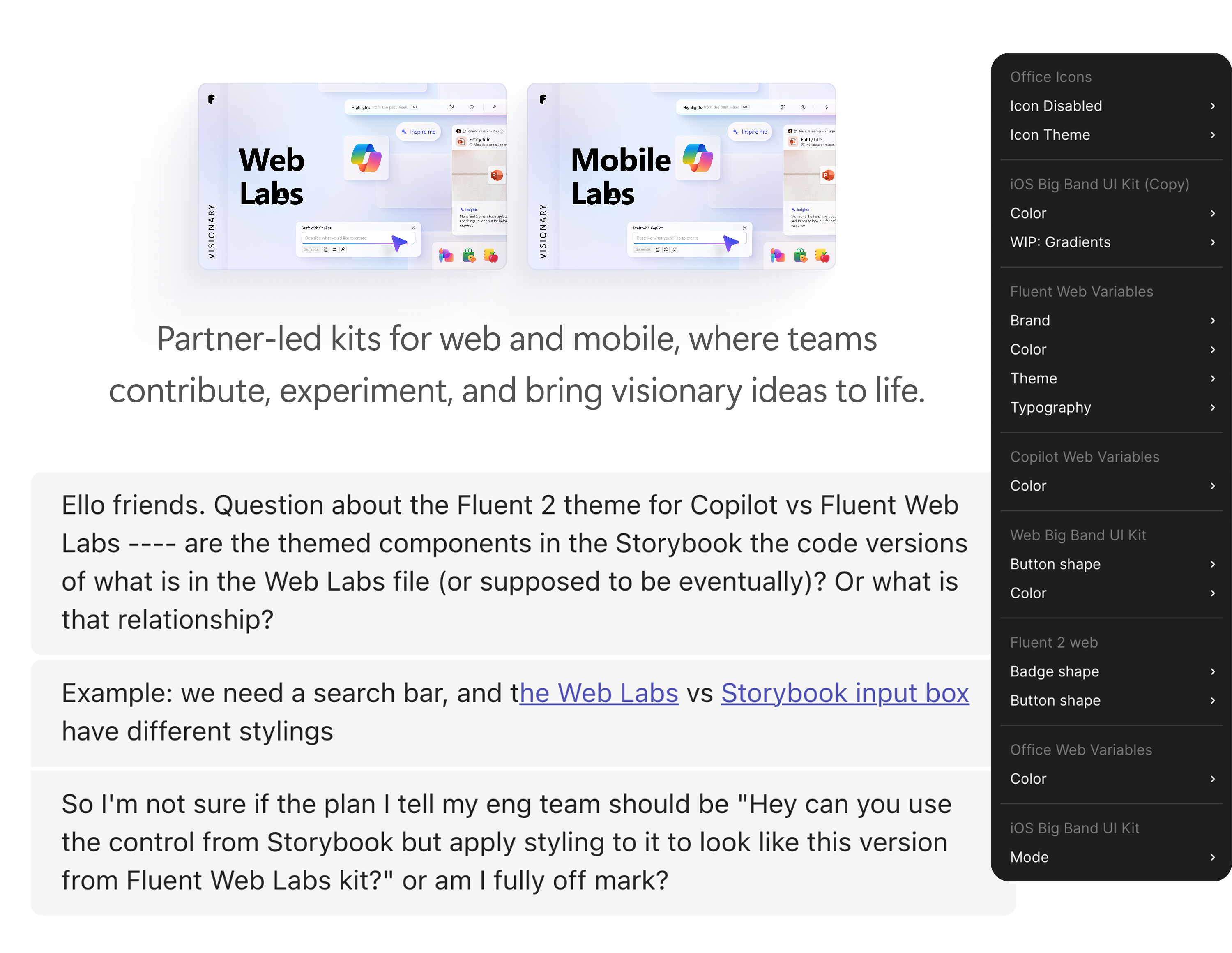
Multiple teams had been exploring a Copilot redesign inside Fluent Web Labs — an experimental Figma space for design assets ahead of stable code. Components built there are in a testing phase, not yet the official stable version; once proven, they graduate into the Fluent Copilot kit. The work had updated radius, spacing, and typography aligned to where Copilot was heading visually. It was a top organizational priority with executive attention behind it, and teams across Microsoft began gravitating toward it — pulling those components into their own Copilot work to stay aligned with where the design direction was heading. The work was spreading faster than the system could support it.
The code hadn't caught up. Storybook components didn't reflect the redesign, so engineers building Copilot surfaces had no authoritative implementation to reference. Designers were building with updated Figma assets; engineers were shipping something different. The gap was real and visible — designers were asking directly what the code story was.
Product teams ran into a second wall when testing. Every team maintained their own variables file with brand color overrides for their surfaces. Using the new Copilot components in Excel, Loop, or Word meant manually updating each component for that brand. The components started getting forked — copied, adjusted, diverged across products — until nobody knew where the source of truth was.
Evaluating options
Proposals
Three approaches were pitched to leadership, each with a different risk profile, timeline, and system investment. The Fluent AI engineers and the Fluent design team's UX engineers weren't aligned — the debate stretched longer than it should have, with real disagreement about which path was right and neither side ready to concede.
While the conversation stalled, something else was happening. Consuming engineering teams weren't waiting. Some had already started implementing the styling changes locally in their own surfaces, ahead of the system engineering team. When that came to light, it changed the calculus entirely.
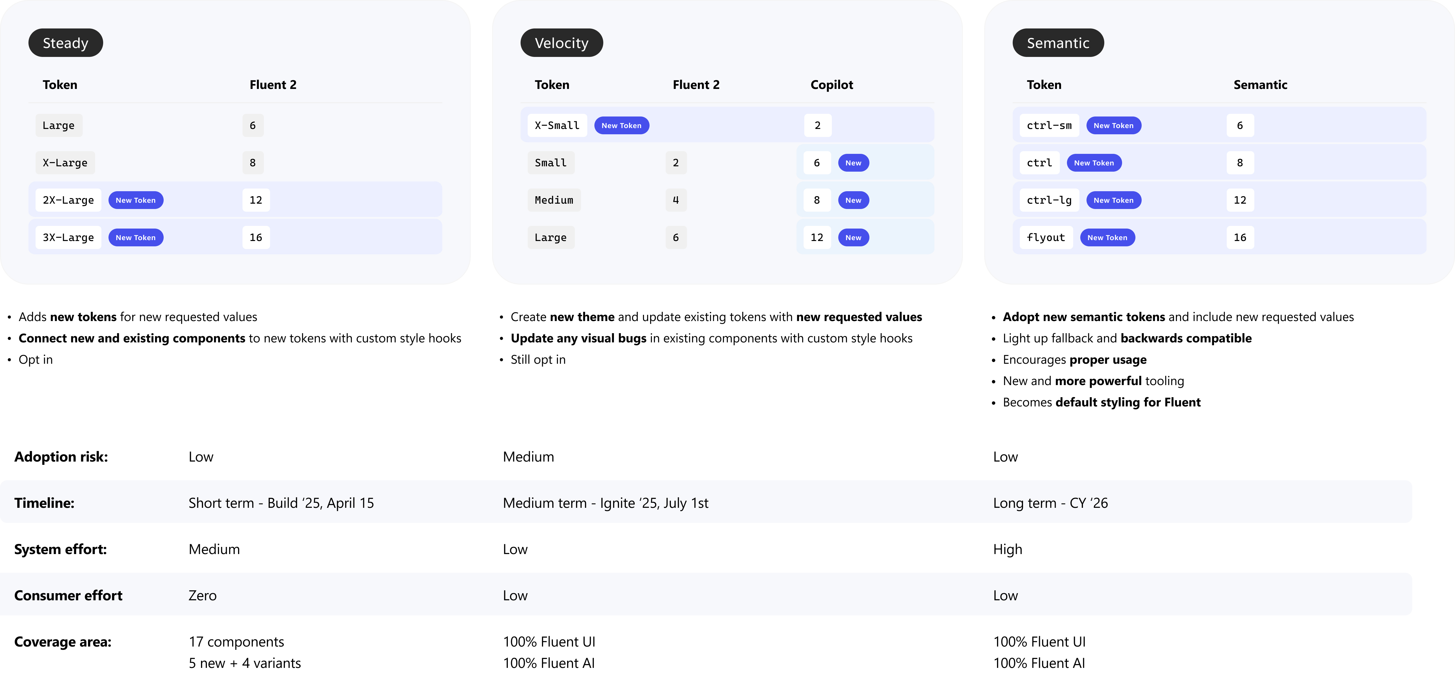
The decision became clear: Velocity was the only viable path. Any approach that required breaking changes would have blown up implementations already in flight across consuming teams. Velocity — creating a new theme, updating existing tokens, and shipping via CopilotProvider as a fully additive layer — left existing consumers untouched. It matched the reality on the ground, hit the Ignite deadline, and left the door open for the longer-term semantic token architecture that comes next.
On the Figma side, the direction was never in question. While the code debate played out, Jack and I ran a proof of concept and connected directly with partner teams to validate the approach would work for their setups. It did.
The changes
Token Updates
Velocity wasn't just a theme — it required expanding Fluent's token scale to support a defined visual language direction. The Copilot design language had explicit threads: more generous spacing, rounder corners, larger typography for long-form content, and brand color reserved only for active states and entities. Three token categories needed to change to make those threads real in the system: radius, spacing, and typography.
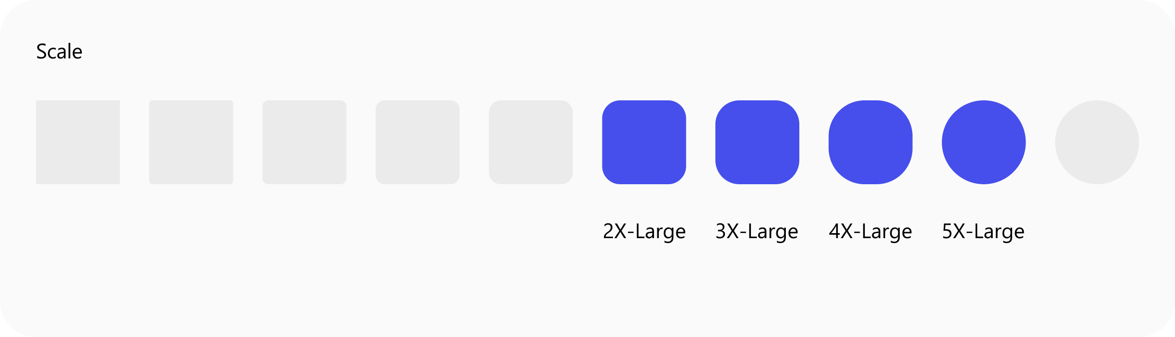
Radius
Copilot components are more round and approachable. Four new tokens were added at the large end of the scale — 2X-Large (12), 3X-Large (16), 4X-Large (24), and 5X-Large (40) — filling the gap between the existing XLarge (8) and Circular (4000).
The token additions were straightforward — the harder problem was coherence. Individual teams had opinions about specific components getting rounder values, but no one had mapped the system as a whole. I identified which components in Fluent 2 shared the same radius assignments and defined how those groups would update together in Copilot, so the rounder aesthetic was intentional and consistent rather than component-by-component guesswork.
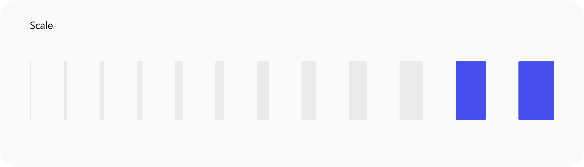
Spacing
Copilot typography has more white space. Two new vertical and two new horizontal spacing tokens were added — 4XL (40) and 5XL (48) in each axis — giving components the room they need to breathe at larger layout sizes.
Typography
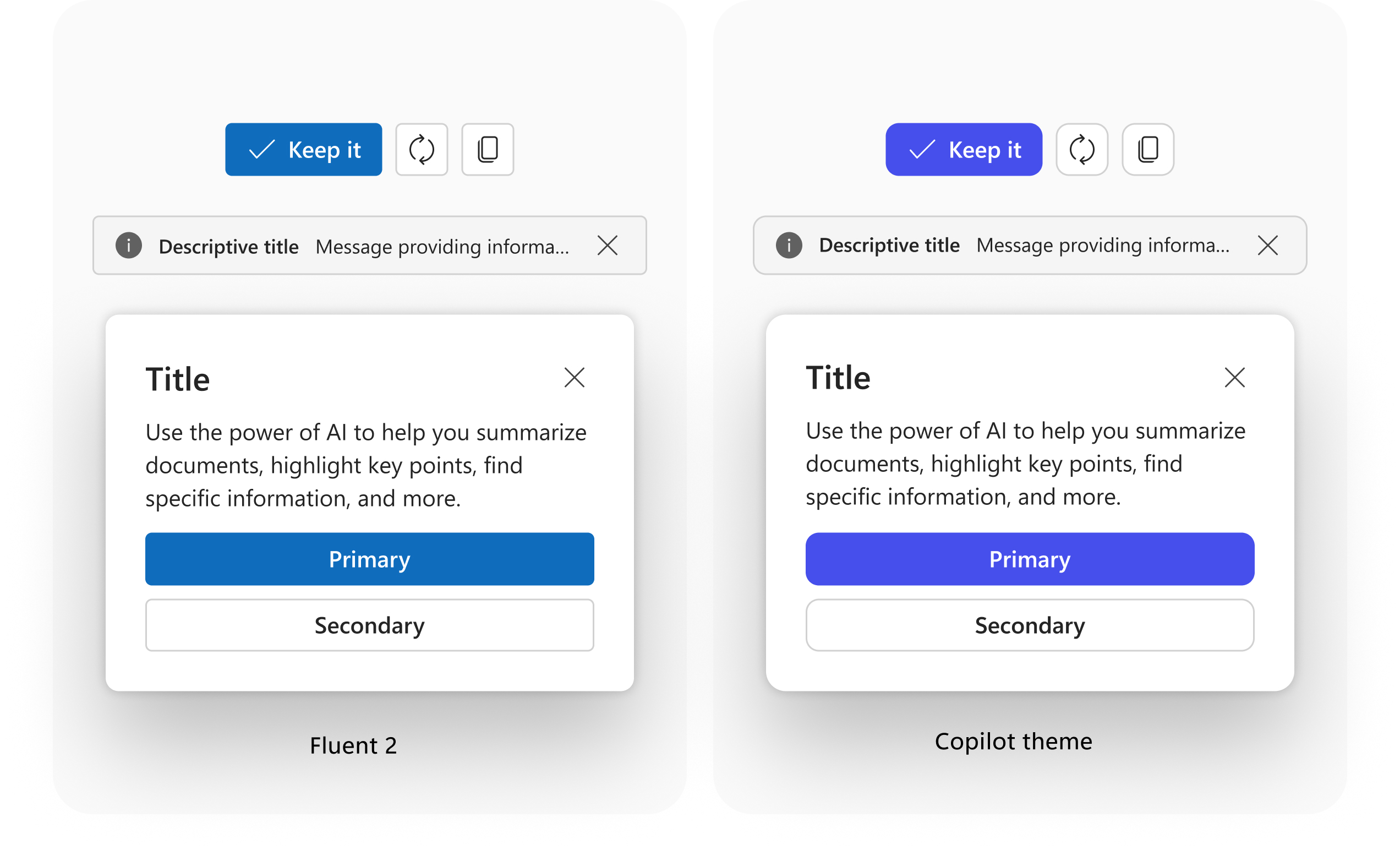
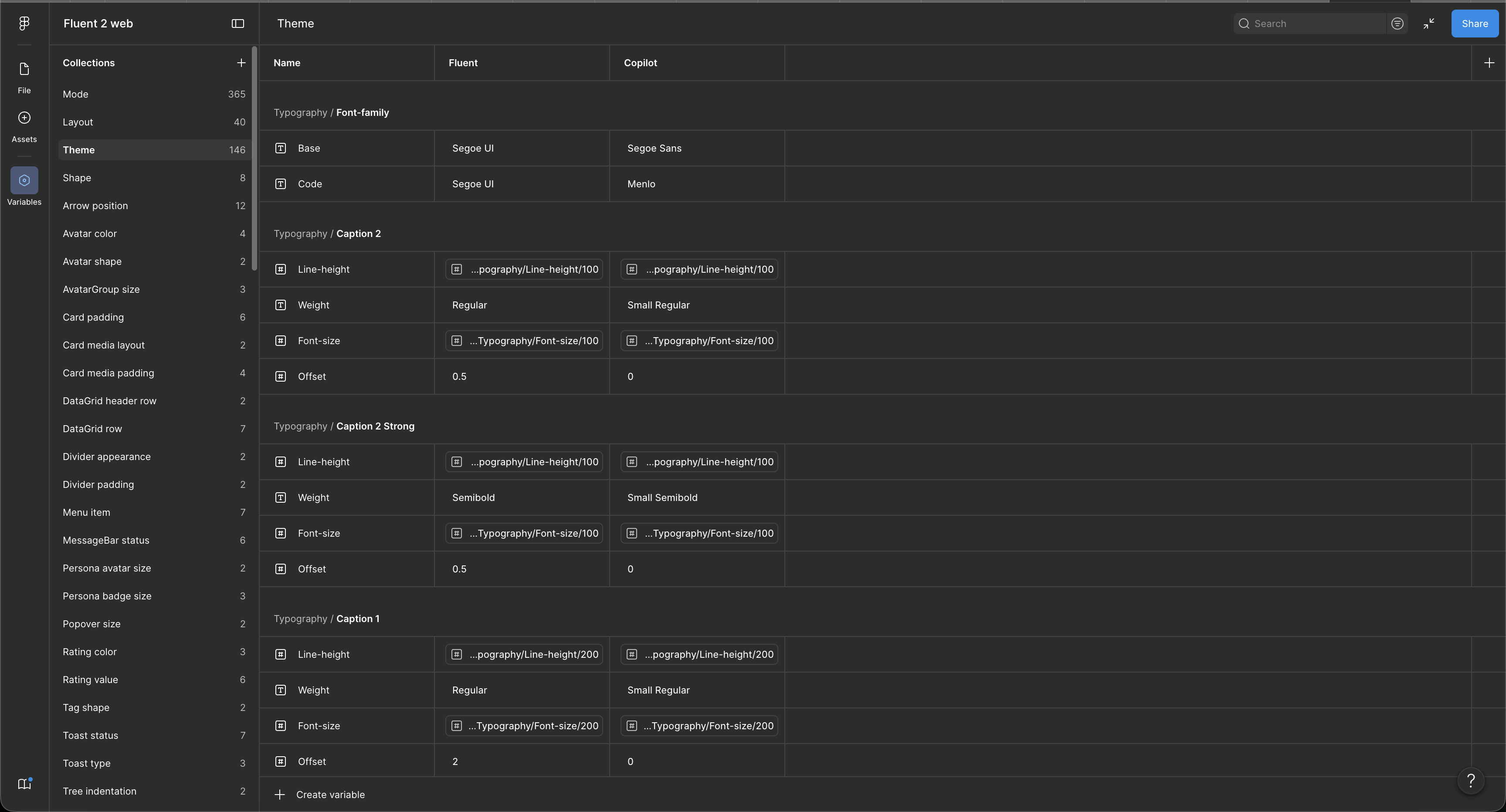
Copilot adopts Segoe Sans — a more consistent rendering on baseline that displays more vertically centered than Segoe UI. New line height and font size values were introduced alongside an updated type ramp mapping revised values across Title, Body, and Caption styles for the Copilot theme.
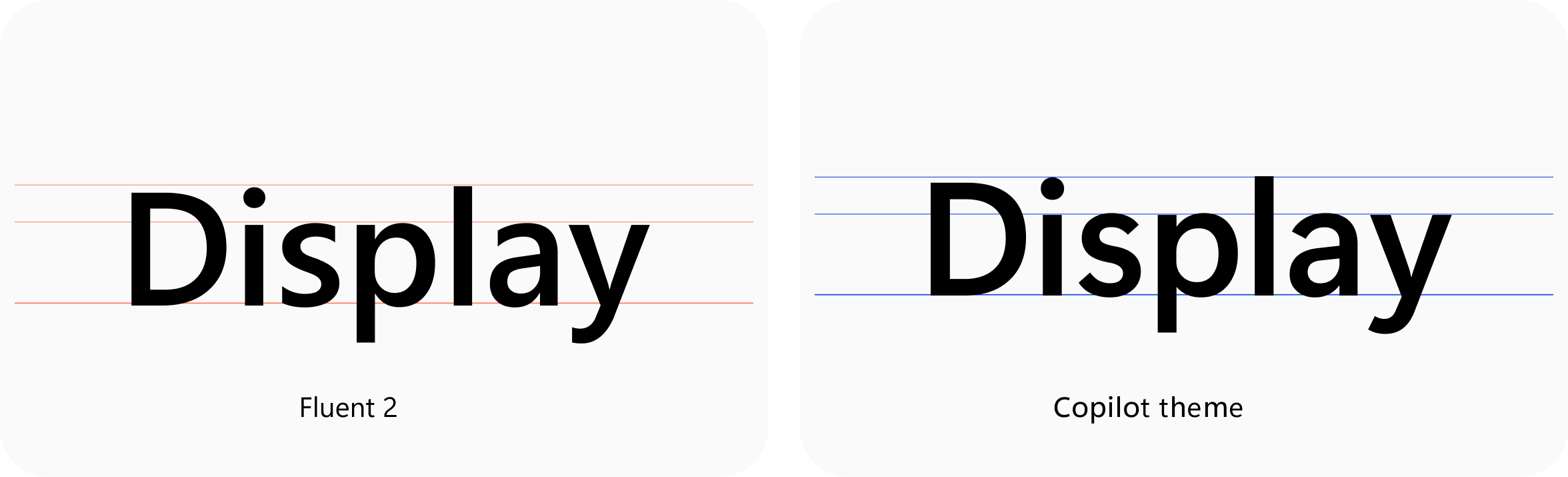
- Noticeable font change — Segoe UI out, Segoe Sans in. The switch is immediately visible: Segoe Sans sits more consistently on the baseline and reads as distinctly Copilot.
- Tighter line height — line spacing is reduced across the type ramp, giving Copilot's text a denser, more focused feel compared to Fluent's default.
- Bolder weight — font weight steps up across styles, adding presence and legibility to Copilot surfaces.
How we got there
Highlight of the Design Process
- 01
Discovery — Audit against the token layer
Mapped Copilot's existing visual decisions against Fluent's semantic token layer. Identified what could bind directly to existing tokens (most things) versus what needed net-new token decisions — primarily Copilot-specific accent values.
- 02
Design — Specs and over-the-shoulder
Design was ahead of code. Once the approach was locked, Jack and I connected every component to the new variable structure in Figma, then produced 24 full before-and-after specs for the primary components. For the remaining 48, we worked over-the-shoulder directly with UXE and engineering.
- 03
Delivery — Validate the framework at scale
Implemented brand theming across the first set of Microsoft brands to prove the pattern held. Brand color overrides were validated with brand teams. Brand theming live before Ignite.
Approach
The Solution
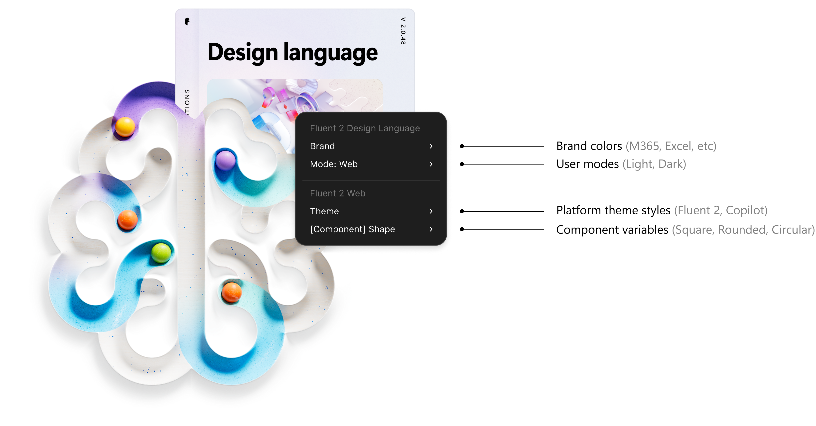
Rather than treating Copilot as a separate design system, the approach was to make it a theme extension — built on Fluent's token layer, overriding only what's distinctly Copilot. The implementation in Figma was a Copilot mode in Variables: designers toggle a single switch between Default (Fluent 2) and Copilot, and every token value updates accordingly — font family, radius, spacing, type ramp, all at once.
Same component, same file, same structure — different mode. This eliminated the need for duplicated component sets between the Fluent 2 core kit and a separate Copilot kit, significantly reducing maintenance surface.
The variable architecture was restructured to separate brand, mode, and theme into distinct switchable layers — so each could be toggled independently without touching the others. That foundation didn't just solve the Copilot redesign problem. It became the prerequisite for the broader UI Kit Refactoring that followed.
A team defined the direction. We made sure it reached every component in the library.
The redesign effort was focused on the components that mattered most for the chat experience — the high-visibility surfaces with the most executive attention. That work was intentional and important. But Fluent isn't just those components. It's 72 components deep, spanning every surface and interaction pattern across M365 Copilot.
No one else was covering the rest. Jack and I filled that gap — taking the visual direction being defined at the top of the priority stack and propagating it consistently across the entire library. Every component needed the right radius assignments, the right spacing, the right typography — all coherent with the new visual language. We didn't just build the infrastructure. We populated it.
Deep dive
The Work
Engineers built style hooks on the components and updated the tokens for the Copilot theme. Each change shipped as a PR — design reviewed every one to confirm the implementation matched the spec. The loop was tight: spec → build → PR → design review → merge.
One of 24 full component specs — light/dark preview, sub-component breakdown, and a token delta table for every changed value.
The output shipped as CopilotTheme v0.1.11 — live in Storybook with every component rendering in both Default and Copilot modes.
Collaborators
The Team
- Karlee — Design Co-Lead
- Jack — Design Co-Lead
- Paul — PM
- Teryn — UX Engineer
- Mason — UX Engineer
- Xue — UX Engineer
- Micah — Fluent AI Engineering
- Mak — Fluent AI Engineering
- Owen — Fluent AI Engineering
Impact
What This Set Up
→ UI Kit Refactor
The Variables mode pattern built here became the direct foundation for brand theming in the UI Kit Refactor. It also gave us the surface area to define formal adoption tiers — Full Adopters who get theming automatically, Customizers who maintain their own variables connected to the Fluent layer, and DIY teams who own their stack entirely. Defining those tiers made the system's support model explicit for the first time.
→ Flex Token System
The pattern analysis work — identifying which components shared radius assignments and how they should be updated coherently — had a longer tail than expected. A toast, a popover, and a menu all had different radii in Fluent 2 when they should have shared the same value. Rectifying those inconsistencies here made the token-to-component mapping cleaner, and that cleaner mapping directly informed the Flex token system work.
→ Fluent Team Maintenance
By eliminating duplicated component sets between the Fluent 2 core kit and a separate Copilot kit, this work reduced ongoing maintenance cost for the Fluent team. Fewer files to keep in sync means fewer opportunities for drift — and more time building forward instead of reconciling backward.