Color Systems · Wayfair Homebase Design System
Where It All Started: Building a Semantic Color System for Homebase
A request to update the primary brand color for a subset of themes revealed a brittle token system. We rebuilt it — establishing semantic variables across Figma, Web, iOS, and Android — turning a 678-update problem into 12.
- Organization
- Wayfair / Homebase Design System
- Role
- Product Design Lead
- Platforms
- Web · iOS · Android
- Partners
- 1 Creative Technologist · 3 Platform Tech Leads
By the numbers
Results
50%
Projected efficiency gain for updating themes via semantic variables and shared token repo
100%
Components utilize shared semantic variables across Figma, Web, iOS, Android, and Icon Libraries
3+
Improved themes by resolving theme exceptions for luxury and specialty retail brands
1
New theme added
678
Total updates required before — for a single brand color change across all platforms
12
Total updates required after — less than 2% of the previous effort
Impact
Before & After
Before
total updates required. Before semantic variables, updating the primary brand color across all components was a significant manual effort.
- 172 web component instances
- 334 iOS + Android component instances
- 339 Figma component instances
After
total updates required. After semantic variables, the design system could support this change at less than 2% of the effort previously required.
- 6 semantic variables (Code)
- 6 semantic variables (Figma)
Background
Design Tokens + Themes
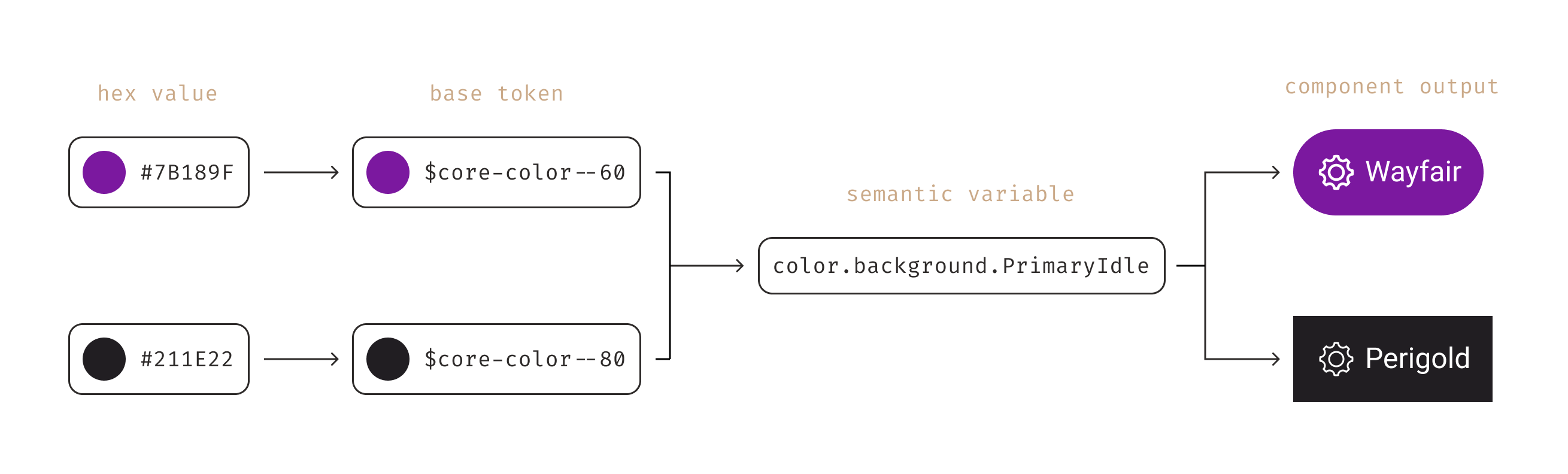
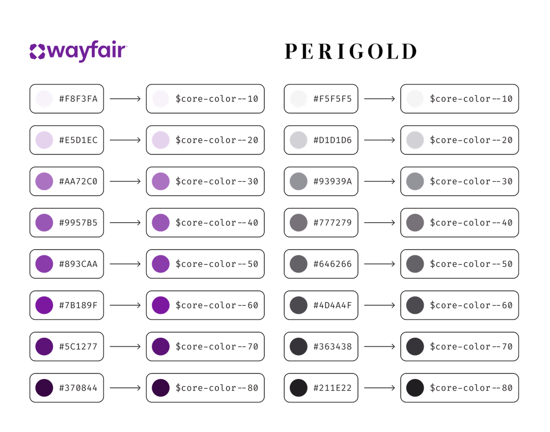
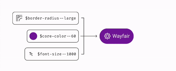
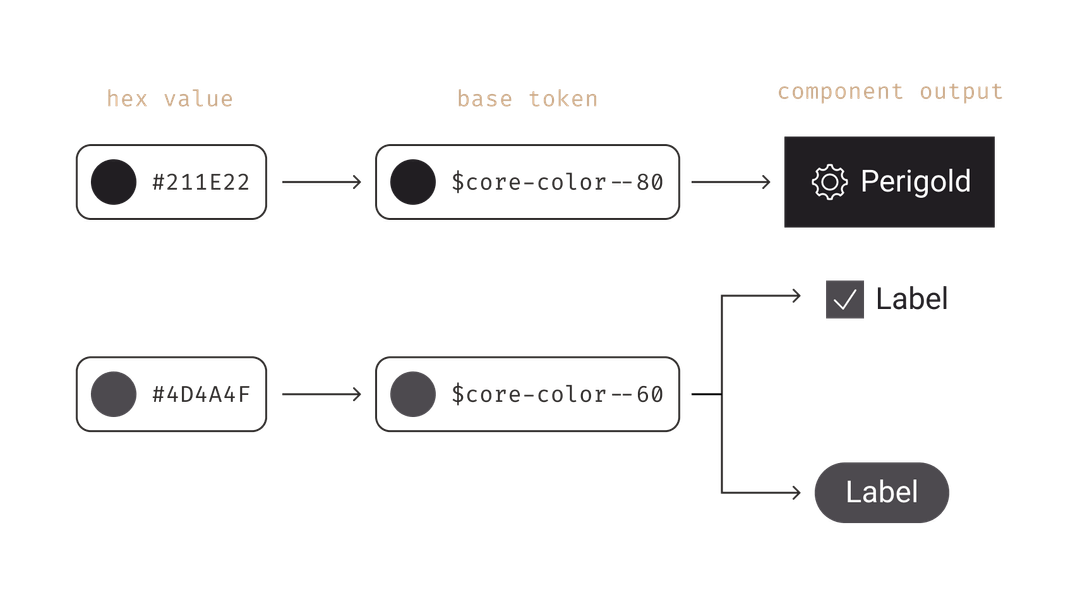
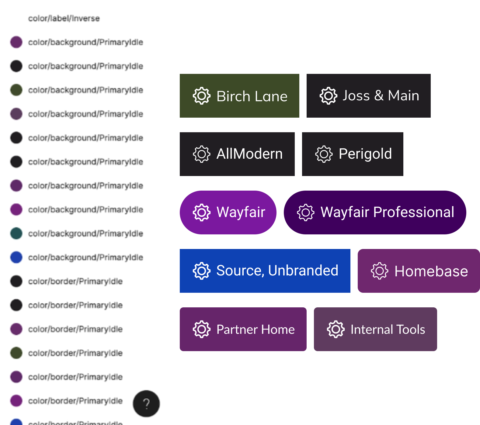
Homebase, Wayfair's design system, encompasses 8 distinct themes for web, iOS, and Android component libraries. Each theme comprises a collection of design tokens — variable sets applied to design system components. Design tokens serve as the foundational elements of the design system and are universally applied across all platforms to ensure brand and design uniformity.
These themes tailor component styles to match the unique aesthetic of different brands
under the Wayfair umbrella. Theme architecture comprises a set of guidelines and principles
that dictate how tokens are utilized throughout the entire system. For example,
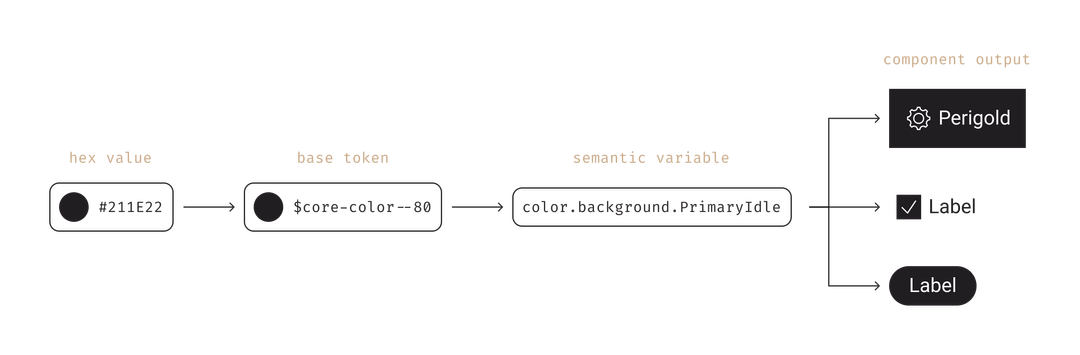
$core-color--60 is the background color for buttons. A simple request to
change the primary brand color to $core-color--80 for a subset of themes for
specialty and luxury retail brands led us to improve our entire color system.
The Problem
We were not maximizing the potential of our design system. Themes were too rigid for specialty and luxury retail stores, making it difficult for them to differentiate their brand identity from Wayfair.
Approach
The Solution
Implement semantic variables into the token system to support scalable brand differentiation across all platforms using a shared token repository and to improve the usability of the design system.

Semantic Variables
While base tokens are primitive values in our system and use context-agnostic naming
(e.g. $core-color--60), semantic variables are an additional token layer on
top of base design tokens applied to components which communicate an intended purpose and
reference the context within the token name (e.g. $backgroundPrimaryIdle).
Semantic variables serve as aliases for foundational tokens and should be characterized
by clarity, meaning, and descriptiveness to effectively convey the corresponding design value.
Benefits of Semantic Variables
Semantic color variables and the use of a shared token repository for web and app helps create stronger brands by weaving brand identity throughout our digital products across platforms in a consistent, meaningful, and maintainable way.
- Hosted in the shared token repository for both web and app engineering to pull from as one source of truth
- Enables consistent color application across web and app components in code and design asset
- Drives cost efficiency when making large-scale color updates
- Allows for more theme differentiation to meet aesthetic brand needs
- Supports a more consistent user experience
- Sets up a framework to expand semantic variables to other token categories (e.g. density, spacing)
- Unlocks future enhancements to support inverted UI and dark mode
Roadmap Commitment
Short Term Fix: Homebase implemented theme exceptions to override styles for the button component on AllModern, Joss & Main, and Perigold to support rebranding efforts. This was a short term fix that worked for a moment but created inconsistent color application throughout components.
Desired Outcome: Semantic variables were added as a high-priority roadmap initiative. Implementation of semantic variables would eliminate the need to create theme exceptions and would also result in the ability to systematically change the primary brand color for all applicable components.
Collaborators
The Team
- Karlee — Product Design Lead
- Blair — Creative Technologist
- Rogin — Web Tech Lead
- Anders — iOS Tech Lead
- Chris — Android Tech Lead
How we got there
Highlight of the Design Process
- 01
Discovery — Evaluate change proposals + stakeholder interviews
Reviewed community-submitted color change proposals and conducted stakeholder interviews to understand pain points and needs for color flexibility. Investigated how Figma Tokens Studio could support semantic variables and theming.
- 02
Definition — Audit tokens + workshop taxonomy
Audited current design tokens across all 8 themes in Airtable, identifying opportunity areas and color usage disparities between platforms. Facilitated an 18+ person workshop with design and engineering to align on naming structure, variable list, and per-theme base token mappings.
- 03
Design — Finalize variables + apply to component catalog
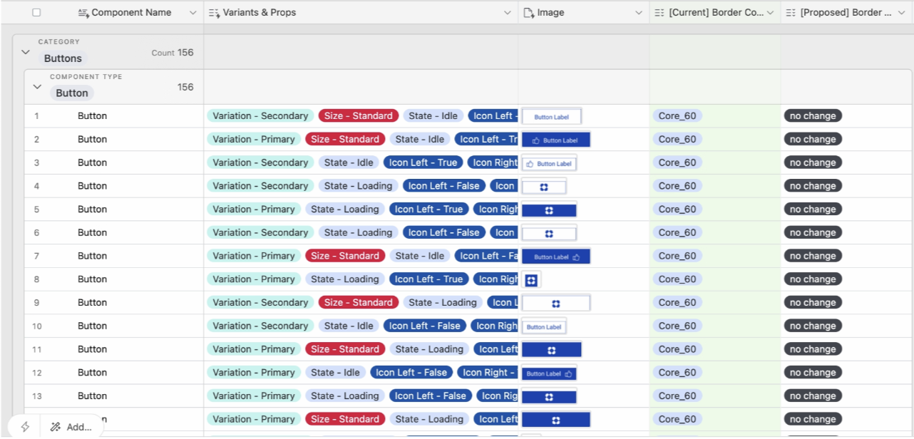
Finalized semantic variable names, definitions, and Figma implementation via Tokens Studio. Created an Airtable migration guide mapping every component's current color usage to new semantic variables, enabling delegation of library work across the full Homebase XD team.
- 04
Delivery — Implement across platforms + doc + educate
Added semantic variables to the shared token repository. Implemented changes across Figma, Web, iOS, and Android libraries. Published documentation and educated the XD community through presentations, help channel support, and office hour appointments.
Deep dive
The Work
Audit Design Tokens + Usage
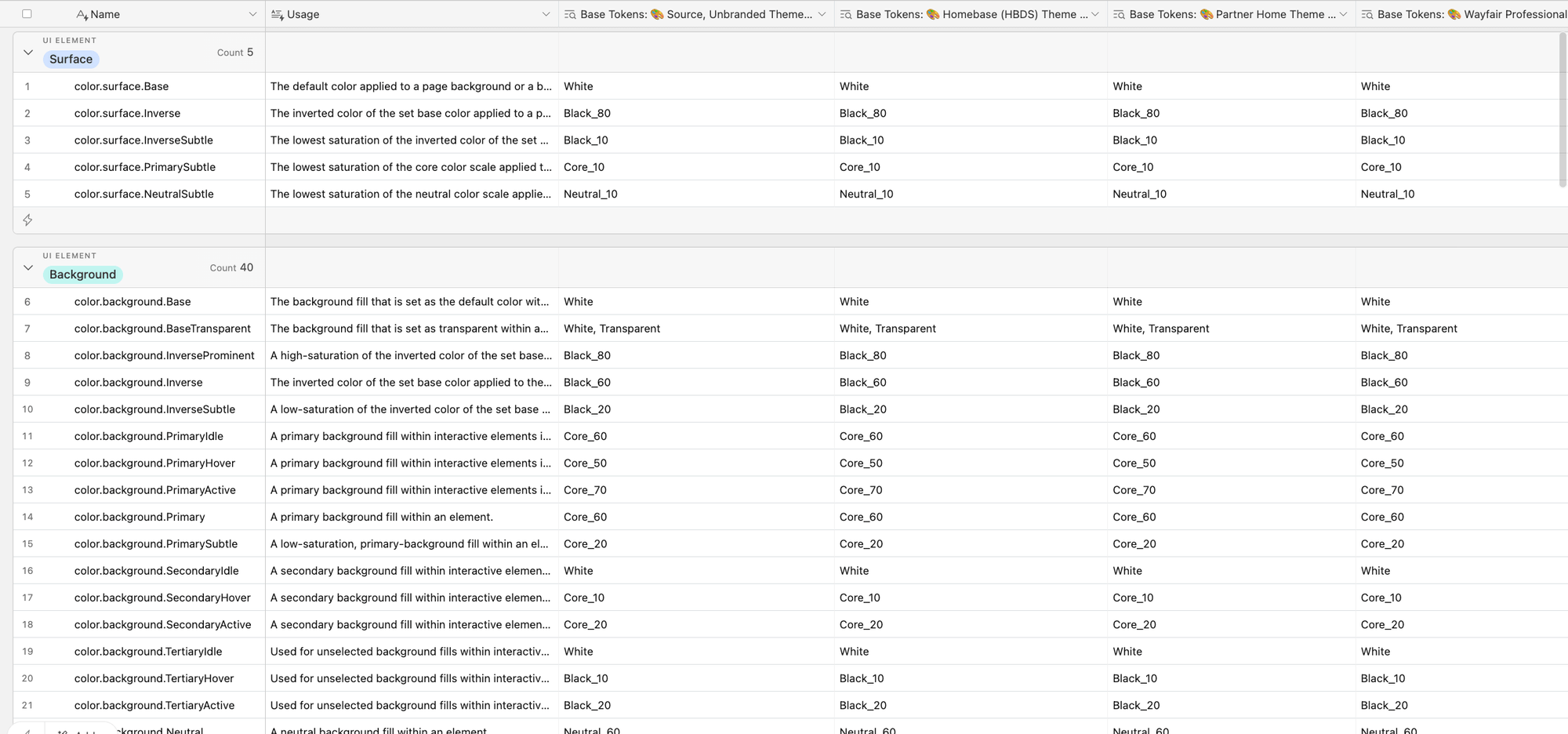
An audit of existing design tokens was conducted to assess their application across web and app platforms, revealing insights that informed the semantic variable token taxonomy and unveiled color usage disparities among components and platforms.
- Evaluated by an Airtable Audit the current color tokens in the web system and legacy semantic variables in the app system to identify opportunity areas within the 8 themes that Homebase supports.
- Reviewed submitted community proposals regarding color changes and stakeholder interviews to learn the current pain points and needs for color flexibility.
- Investigated and determined how Figma Tokens Studio would support semantic variables and theming.
Identified Opportunities
- Documenting color usage with semantic variables is essential to solidify detailed design choices and ensure the accessibility of our design system.
- Establish design consistency across platforms through the utilization of shared design tokens.
- Minimize the effort required to update themes by making updates in a centralized place where changes automatically flow to all relevant areas.
Workshop of Token Taxonomy
I facilitated a workshop with 18+ collaborators — designers and engineers across web, iOS, and Android — to review the proposed token taxonomy. The goal was to align on decisions together and build cross-platform buy-in before any implementation began.
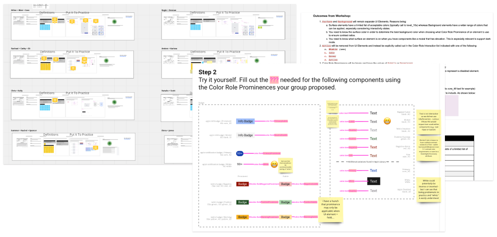
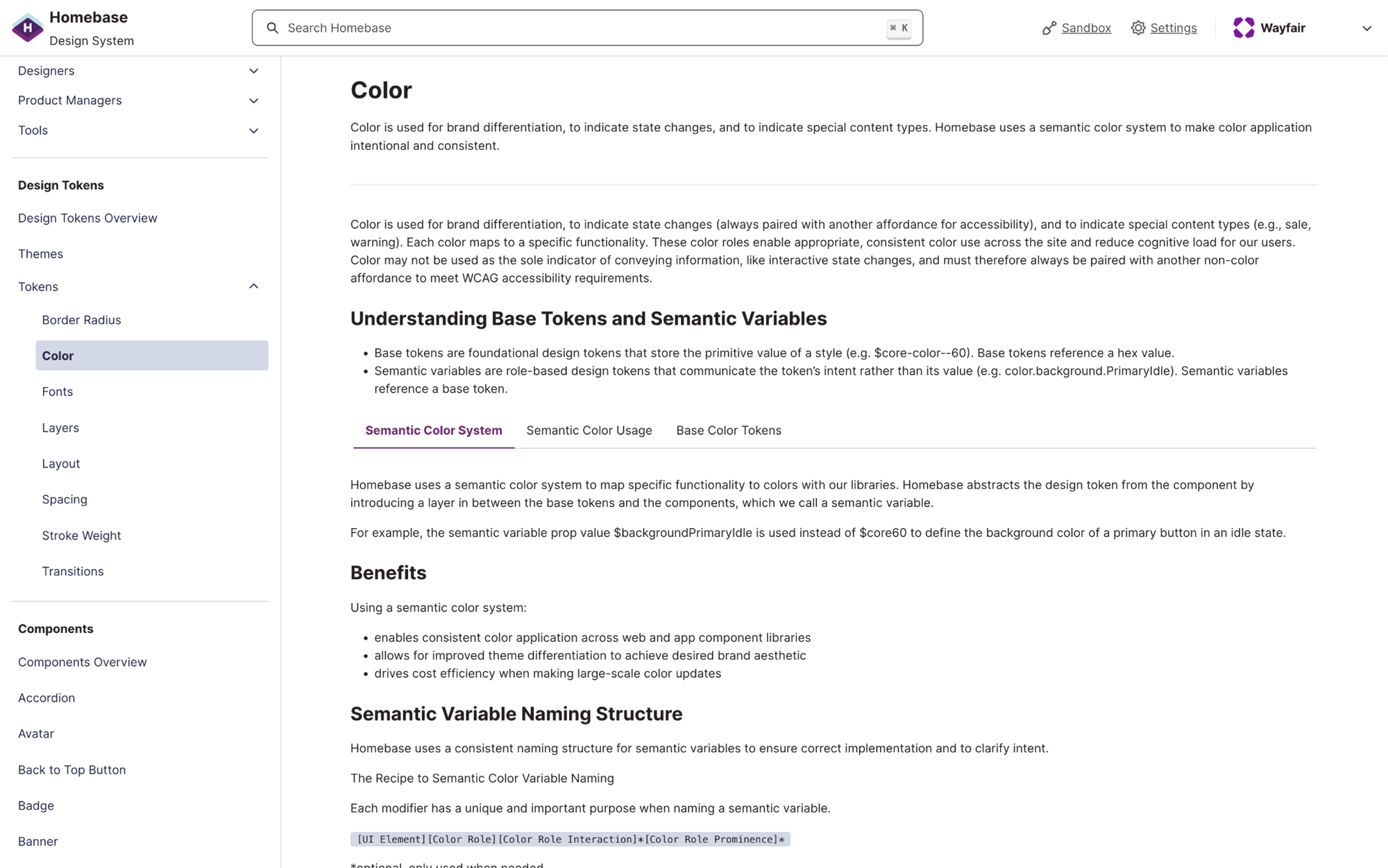
Workshop outcome — naming recipe
The workshop produced a semantic variable naming structure, a finalized variable list with definitions, and each variable's base token mapping per theme — the implementation source of truth across all four platforms.
![The Recipe to Semantic Color Variable Naming: color.[UI Element][Color Role][Color Role Interaction]*[Color Role Prominence]* — asterisked parts optional](/wayfair-workshop-outcomes.png)
Prototype Variables in Figma
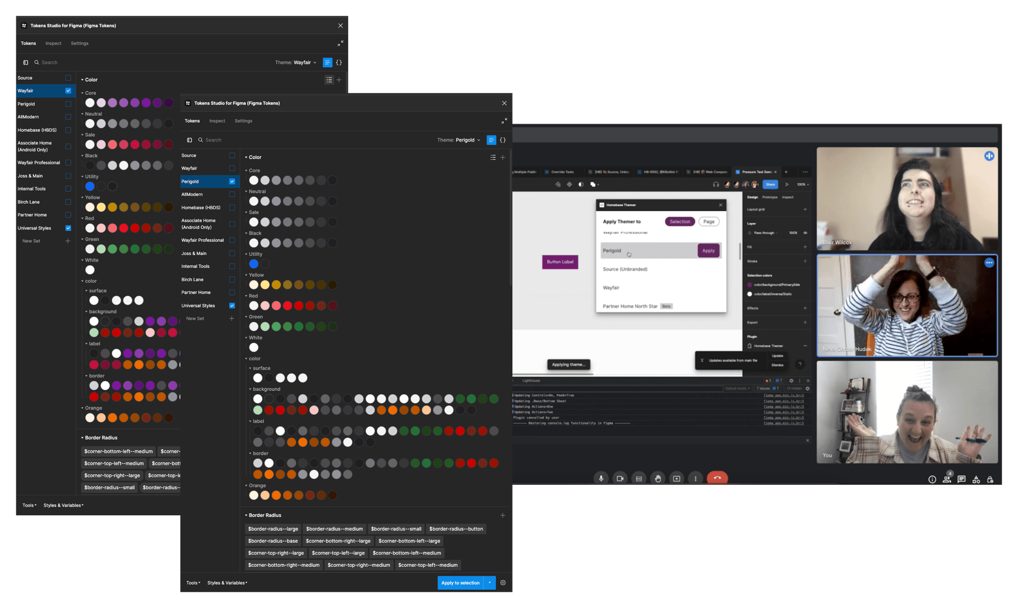
At the time of this project, Figma did not have native support for variables. I coordinated a spike with engineering to investigate Tokens Studio to support semantic variables in Figma. The investigation was successful (pictured!) and we were able to use Tokens Studio to document semantic tokens and apply them to components in our libraries.
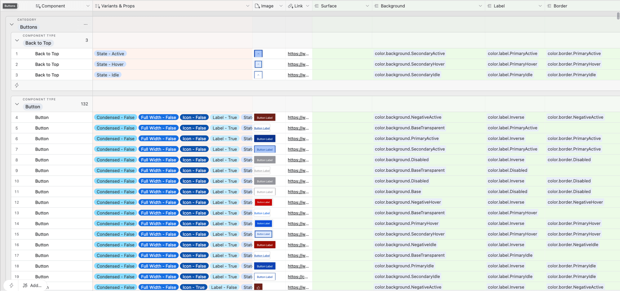
Apply Semantic Colors to Component Catalog
To assist the design and engineering team in applying semantic color variables to components, I created a migration guide that mapped current assigned color usage on all components across web and app libraries to new semantic color variables.
The Airtable guide allowed me to delegate Figma library implementation across the entire Homebase XD team giving all designers hands on experience working with semantic color variables to build shared knowledge of our design system.
Implement Across Figma, Code + Doc Site
Implemented semantic variables in every Figma theme library, validated theming across web, app, and system icon libraries, and worked alongside engineering to update code assets using the migration guide. Published documentation on the Homebase doc site and educated the XD community through presentations, help channel questions, and office hours.
Looking ahead
What's Next
- Token category expansion — the semantic variable process is roadmapped for density, motion, spacing, and type. Same naming pattern, same workshop and migration approach.
- After launch, Web and App squads each hosted hackathons. Teams at both built dark mode proof-of-concept experiences using the semantic color system — earning recognition from senior VP leadership.
- The Shipping Widget team used the framework to introduce Speed and Premium semantic color tokens, achieving accessible, brand-coherent colors that adapt automatically to all widget instances.