Design Systems Research · Wayfair Homebase
Overlays and UI Regions, Oh My!
A community proposal to update Homebase's Drawer component led to an audit of 17 public design systems, a hand-calculated box-and-whiskers analysis, and the conclusion that what teams actually needed was a brand new component entirely.
- Organization
- Wayfair / Homebase Design System
- Role
- Product Design Lead
- Published
- Homebase Documentation Site
- Outcome
- New Sidebar component shipped
Context
This was a blog post written for the Homebase Documentation Site, showcasing the process the design system team takes when a community proposal is submitted to change a current component within the system.
Background
Have You Ever Heard of the Drawer Component?
The drawer is a widely used overlay component across Wayfair — from the Mini Cart on Storefront to Pricing Filters on the Pricing Home Products tab in Partner Home. Homebase has received various proposals from a wide range of teams to alter the drawer component to fit their specific needs. But oftentimes, it's actually a different component that's needed altogether.
How does Homebase reach that conclusion with proper justification? Below we'll dive into a specific case study on Homebase's drawer component and how Homebase ultimately determined not to update it based on a community proposal — and what we built instead.
The Research
The Overlay Component Matrix Audit
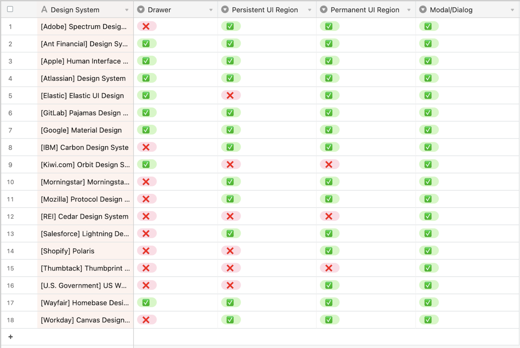
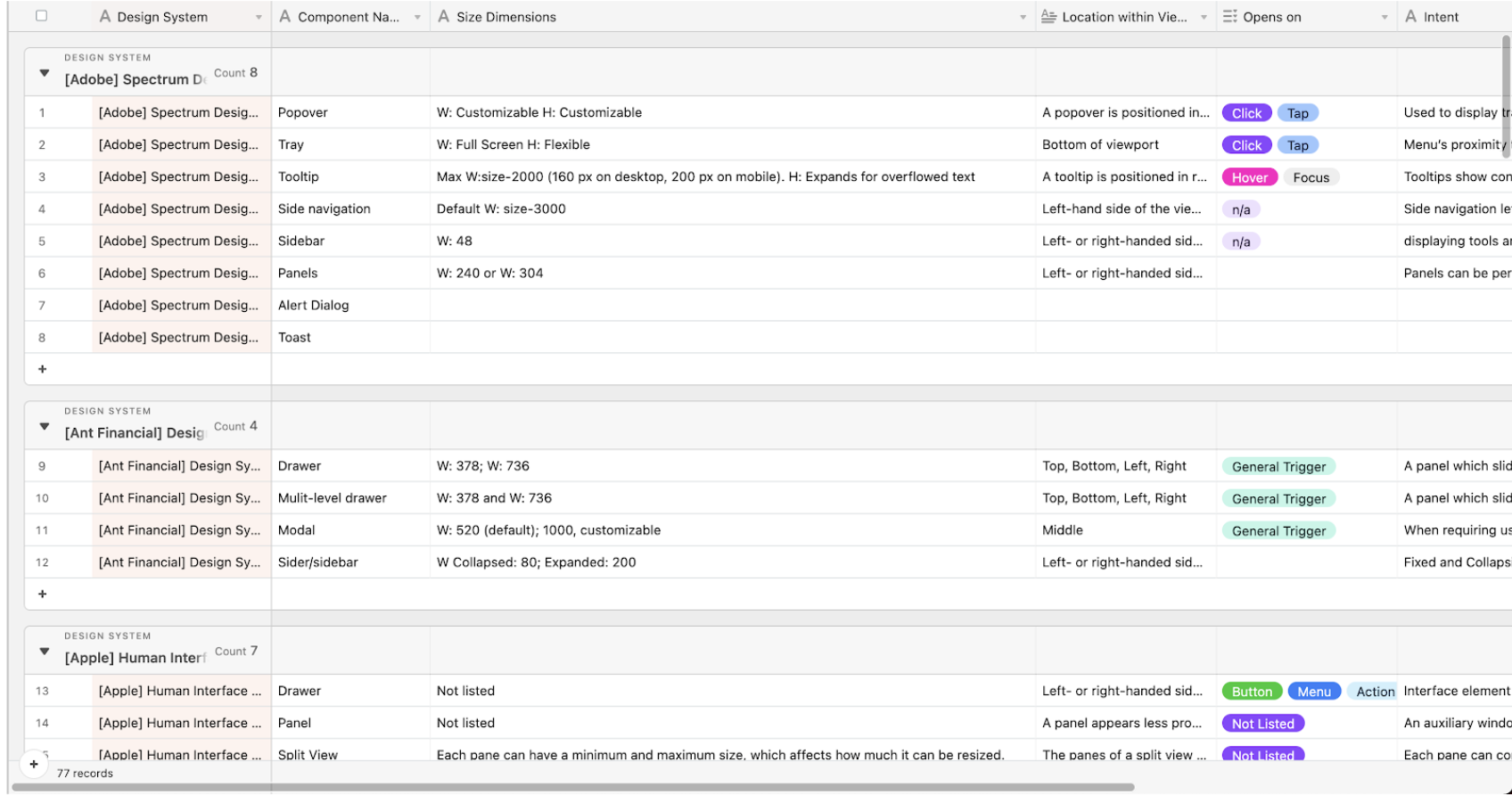
An audit of 17 public-facing design systems was conducted to examine four areas:
- What types of overlay components do they support?
- What are the dimensions and locations of these components?
- What is the behavior and intent of these components?
- Do they have something similar to Homebase's UI Regions?
We then narrowed in specifically on drawer- and UI Region-like components to examine where our opportunity areas were.
Findings
The Results
It did not come as a surprise that most design systems do not support a drawer component — 10 of 17 systems audited don't offer one at all. To understand the flexibility in sizes offered by comparable components (panels, rails, sidebars), we catalogued every supported dimension across all systems.
The Analysis
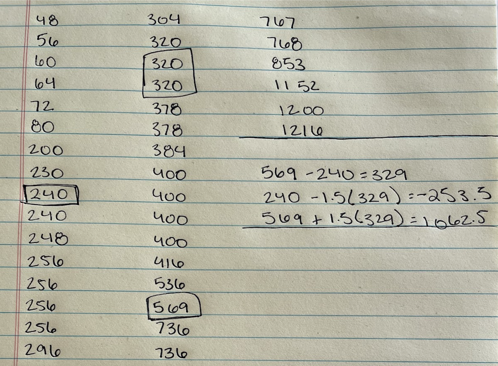
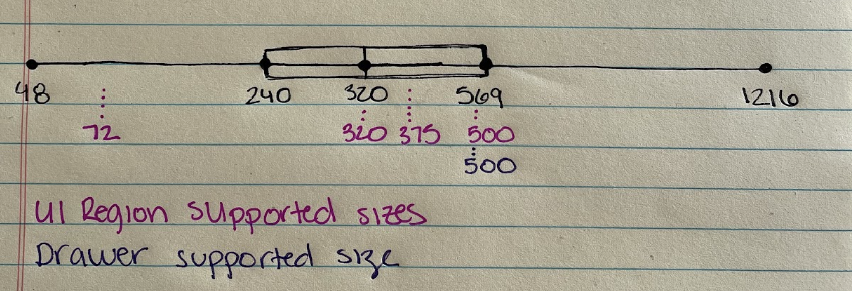
Who Remembers High School Math's Box and Whiskers Plots?
A box and whiskers plot lets you easily visualize the summary of a set of data. Since we had collected all of the dimensions of Drawer- and UI Region-like components in our audit, all we needed to do was plot them to see how Wayfair's drawer compares to the range across 17 other systems.
TL;DR: Between Homebase's supported Drawer and UI Regions, the sizes fall well within the standard range when compared to 17 other design systems.
Visual check
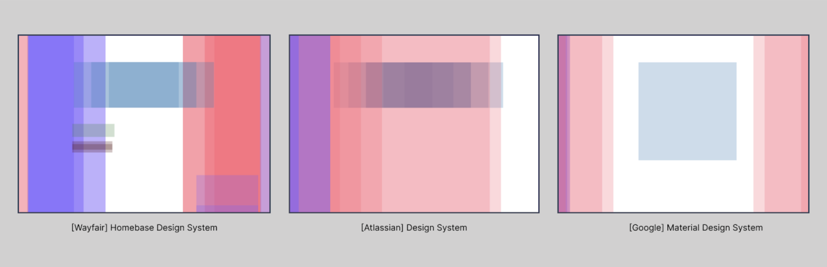
More of a Visual Person?
Take a look at the coverage maps below, comparing Homebase's overlay coverage to that of Atlassian and Google Material Design — the breadth of coverage is quite comparable.
The Outcome
What's Next?
Finding
Between the Drawer and UI Regions, Homebase has many comparable components to other design systems. But while the Drawer is serving most use cases, teams need additional support implementing UI Regions — which are a grid concept, not an actual component. That gap became an opportunity to build a more flexible, componentized solution.
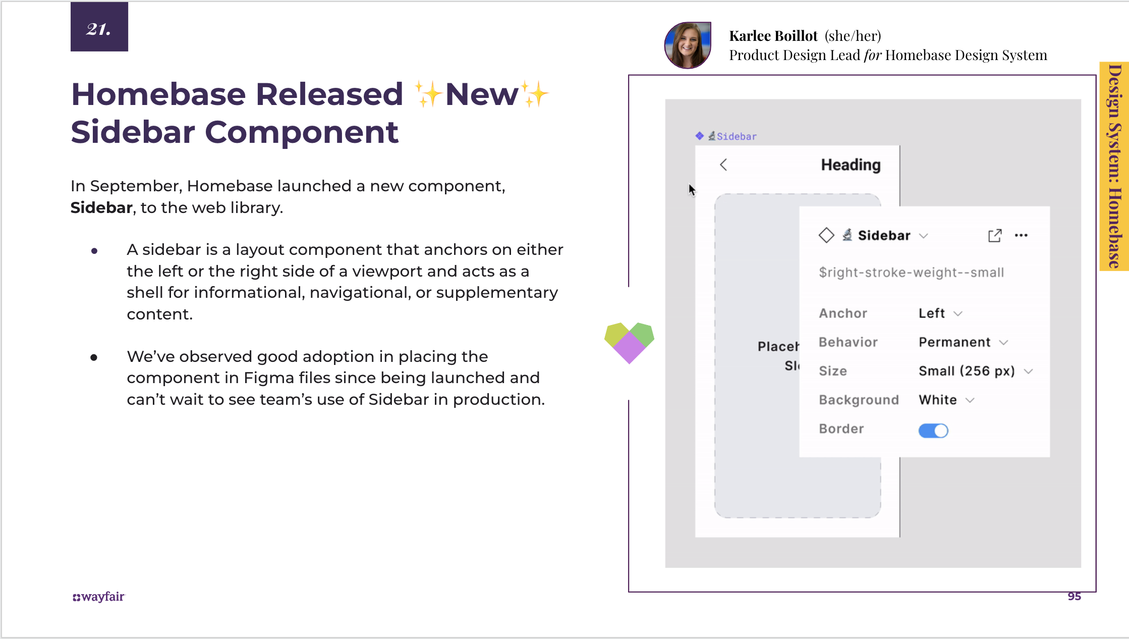
Creating a New Component: Sidebar
A sidebar is a layout component that anchors on either the left or right side of a viewport and acts as a shell for informational, navigational, or supplementary content.
Here's how we got there:
- Homebase received a community proposal to update the existing Drawer to be more flexible in sizing and anchored placement
- Homebase XD completed an investigation into 17+ design systems' overlay and UI Region-like components to assess the gap
- Most systems audited don't offer a drawer like Homebase's — but many offer something closer to Homebase's UI Regions, which are a grid concept, not a component
- The analysis showed the existing Drawer serves most use cases; the real opportunity was componentizing UI Regions for more anchored, flexible layouts
- Homebase XD drafted usage guidelines and vetted functionality with engineering, accessibility, and community partners
- Designs were built in Figma with the supported variations, then engineering built the component and demos for the documentation site
Looking ahead
What's Next
- The Sidebar launched to the Homebase web library with Anchor, Behavior, Size, Background, and Border properties — good adoption observed in Figma files within weeks of launch.
- This research process became a repeatable template for evaluating community proposals: audit comparable systems, quantify the gap, visualize the coverage, then decide whether to update or build new.
- The conclusion that teams needed better UI Region support — not just a bigger Drawer — reframed how Homebase approached layout primitives going forward.