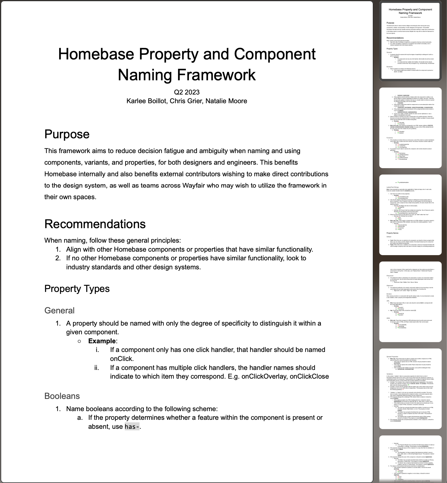
Naming Systems · Wayfair Homebase Design System
Component + Property Naming Framework
Naming things is hard. Homebase lacked shared conventions — the same prop did different things on different components, and teams building domain-specific components had no standard to follow. We built a research-backed framework that drove 471 changes across Figma and code.
- Organization
- Wayfair / Homebase Design System
- Role
- Product Design Lead
- Platforms
- Web · iOS · Android
- Partners
- Chris Grier · Natalie Moore
By the numbers
Results
471
Total changes — 231 in Figma design assets, 240 in web code assets
56
Figma components updated across web design libraries
78
Web code components updated to the new naming standard
11
Naming categories addressed across property types, names, and values
3
Domain teams adopting the framework: Core, Block Builder, App Reusable
5/6
External engineers surveyed expressed support for the proposed changes
The Problem
The absence of a shared framework that standardizes naming conventions across disciplines introduces complications to our design system, especially for designer-to-developer handoff when facing inconsistencies.
Background
Why Naming Matters
Homebase was growing rapidly — and naming had never kept pace. Users of the design system were faced with increased friction when:
- Props that do the same thing have different names on different components —
totalon Progress Bar vs.maxon Histogram Bar - A prop's name isn't a reliable indicator of its type —
isAvailableDateon Calendar looks like a boolean but accepts a function - Prop values aren't consistent — sometimes
subtle, sometimesmuted
As a team, we were also asking ourselves:
- What does "default" really mean anyways?
- Why does "variation" map to size, color, intent, or style depending on the component?
- Why is it called a badge on web but infobadge on app?
Teams building domain-specific components looked to Homebase for naming standards — an opportunity to influence Wayfair's design and development culture at scale.
Approach
The Solution
Implement a standardized naming framework for design and code assets. A shared framework would scale with the organization, enhance cross-functional collaboration, and reduce decision fatigue and ambiguity when introducing new components and properties.
How we got there
Design Process
- 01
Discover — Audit components + properties across code and design
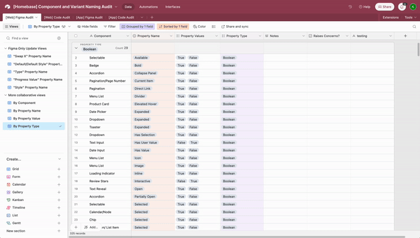
Conducted a cross-platform audit of all components and their properties across app and web. Centralized all naming decisions to surface inconsistencies and prioritized 11 opportunity areas across property types, names, and values.
- 02
Define — Two workshops to align on standards
Workshop 1 with project leads tackled booleans, borders, position, and functions. Workshop 2 brought in stakeholders from three domain teams using card sorting, rating scales, and pressure testing to define standards for strings, variations, colors, and sizes.
- 03
Deliver — Implement across Figma, code + doc site
Applied the framework across all Figma design libraries, web code components, and the Homebase documentation site. 231 Figma changes across 56 components and 240 code changes across 78 components.
Deep dive
The Work
Audit Components + Properties
We audited components and their properties across code and design for both app and web. Despite progress made with Figma component properties to align design and code, significant misalignment remained. We prioritized 11 areas across three categories:
Property Types
- Booleans — accepts true/false to toggle an attribute on or off
- Text Strings — values that represent text (labels, URLs)
- Functions — called at a specific event, e.g.
onClick
Property Names
- Default — used inconsistently; "Primary" in App isn't accurate
- Variant/Variation — used as a catch-all with no guidance
- Position/Alignment/Placement — all used for similar props
- Borders — sometimes booleans, sometimes separate variations
- Colors — spread across Variation, Color, Background, Style, Appearance
- URL/HREF — no consistent convention across web and app
- ARIA Props — no standard recommendation for formatting
Property Values
- Sizes — sizing options not standardized across the system
- Colors — specific color values rather than semantic intentions, not scalable for dark mode
Within certain groupings, decisions could be made by engineering and design leads guided by research and system best practices. For other areas, we determined the need to conduct cross-functional workshops to gather feedback and better understand how teams utilize and interpret Homebase assets.
Workshop 1 — Project Leads
The first workshop brought together engineering and design leads to tackle four areas where decisions could be made without broader stakeholder input: Borders, Position/Alignment/Placement, Booleans, and Functions. Activities included grouping audit findings into opportunity areas and pressure-testing proposed guidelines directly against current naming — helping identify outliers and edge cases early.
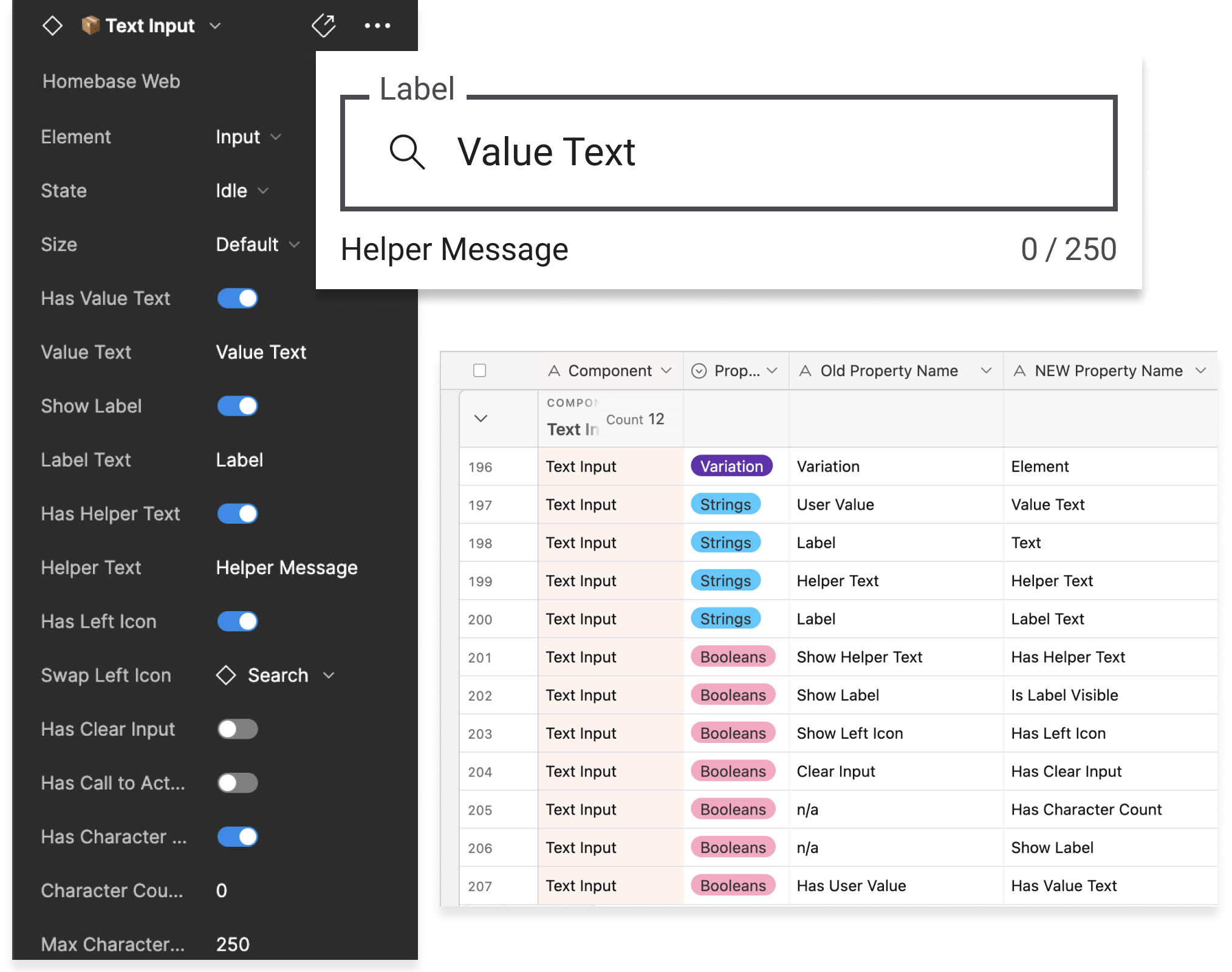
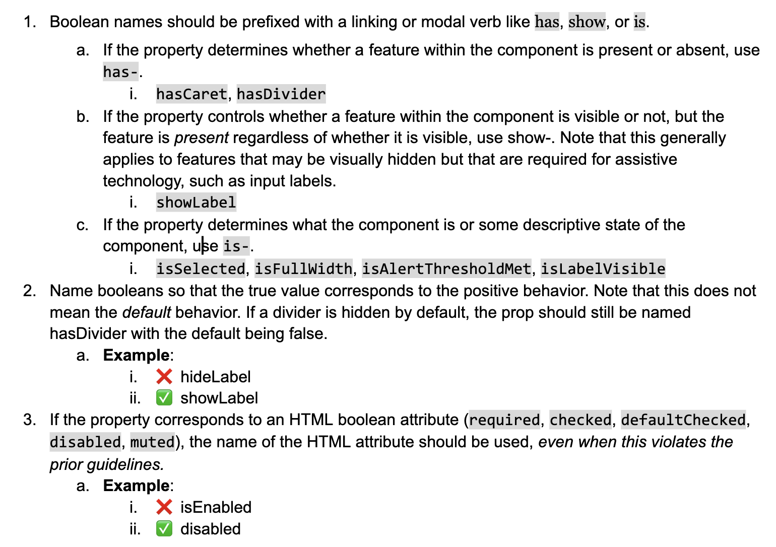
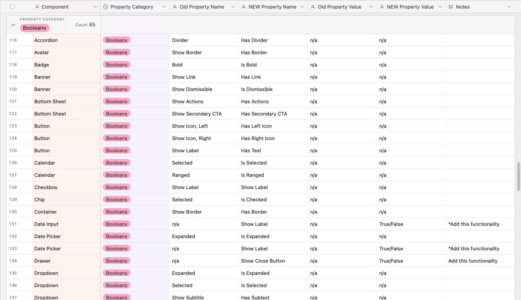
Booleans Deep Dive
We narrowed down a set of guidelines for best-practice boolean naming, then compiled all boolean instances across web and app design and code to evaluate updates against those guidelines.
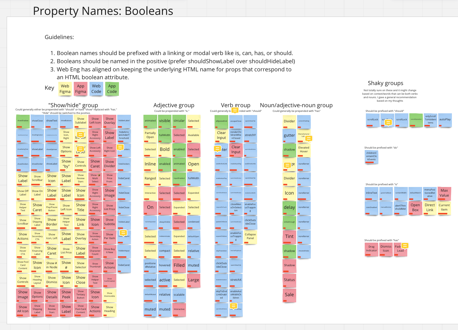
After grouping, we mapped every boolean to its new name across code and design:
- 85 boolean properties identified to be updated in Figma web design assets
- 87 boolean properties identified to be updated in web code assets
Workshop 2 — Domain Team Stakeholders
The second workshop brought in stakeholders from three domain-specific reusable component teams — designers, engineers, and product managers — to tackle four areas requiring broader input: Text Strings, Variation/Variants, Colors, and Sizes.
Three activity types were used, each targeting a specific question:
- Rating scales — gauged clarity of terminology on a broad-to-specific spectrum
- Card sorting — surfaced mental models for how teams group and label concepts
- Pressure testing — applied proposed conventions directly to real components to expose edge cases
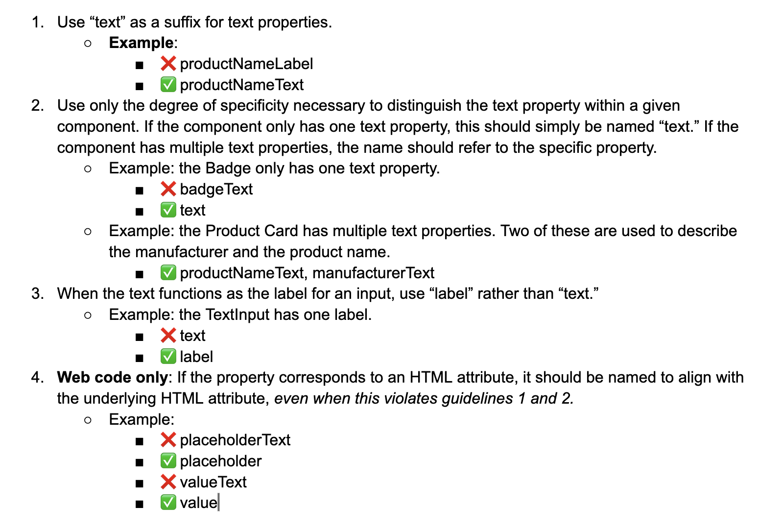
Strings — A Closer Look
We set out to understand how specific Homebase component strings should be labeled at the most atomic level. 75% of participants indicated that Homebase needs to provide specific strings on the broad-to-specific scale.
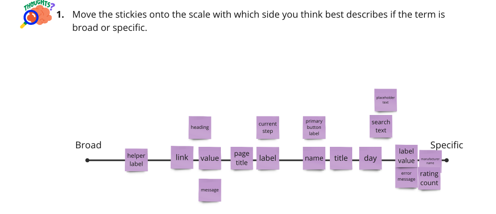
Workshop finding — Strings
"Text" and "Label" were most preferred, with "Text" leading. Groups diverged on
specificity: one advocated simply text; one advocated label;
one advocated label text; one advocated a component prefix like
badge text. Leads chose a middle ground — specificity where it aids
clarity, brevity where the context is obvious.
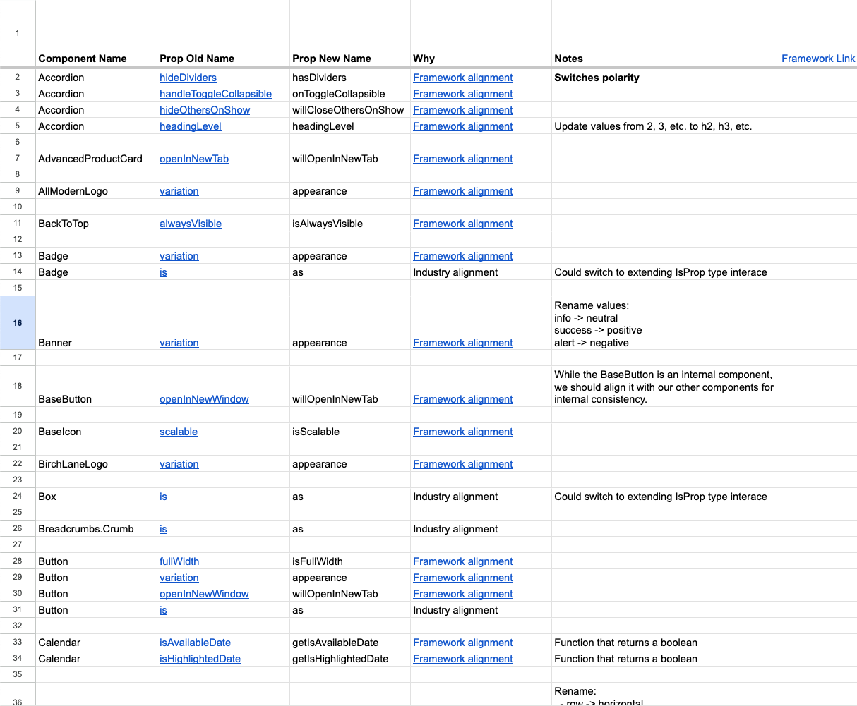
The Framework
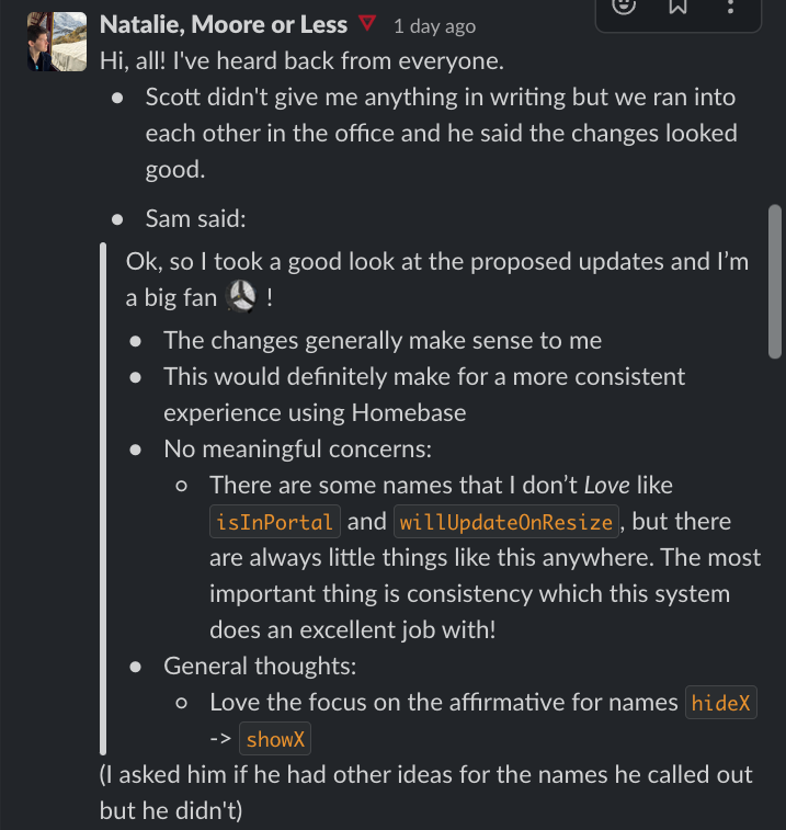
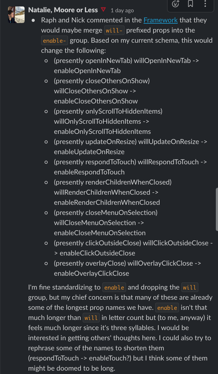
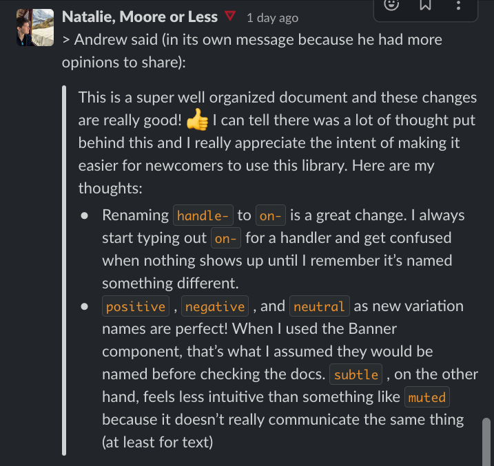
The framework — co-authored with Chris Grier and Natalie Moore — outlined best practices for all 11 categories across design and code assets. It was circulated to stakeholders, shared with the full Homebase team, and reviewed by six external web engineers. Every respondent expressed positivity; 5 of 6 explicitly supported the proposed updates.
Reception
Engineer feedback came in through Slack before the framework was even officially published. The responses validated both the substance of the changes and the approach of building shared understanding before enforcing new standards.
Looking ahead
What's Next
- The framework became the naming standard for three domain-specific component teams — Core Components, Block Builder, and App Reusable Components — each referencing it to make decisions for their own components.
- Consistency across Figma, Storybook, and the Homebase doc site reduced design-to-development handoff friction, decreasing naming questions across help channels.
- The workshop methodology — audit, align, pressure test — established a repeatable pattern for tackling other areas of system ambiguity beyond naming.